Website launch after website launch. That is what we do, day in and day out: successful websites for our clients.
Our 5-Step Proven Process is efficient, seamless, and ensures a timely launch. Our projects exceed client expectations.
Basically, it’s our job to knock it out of the park every single time.
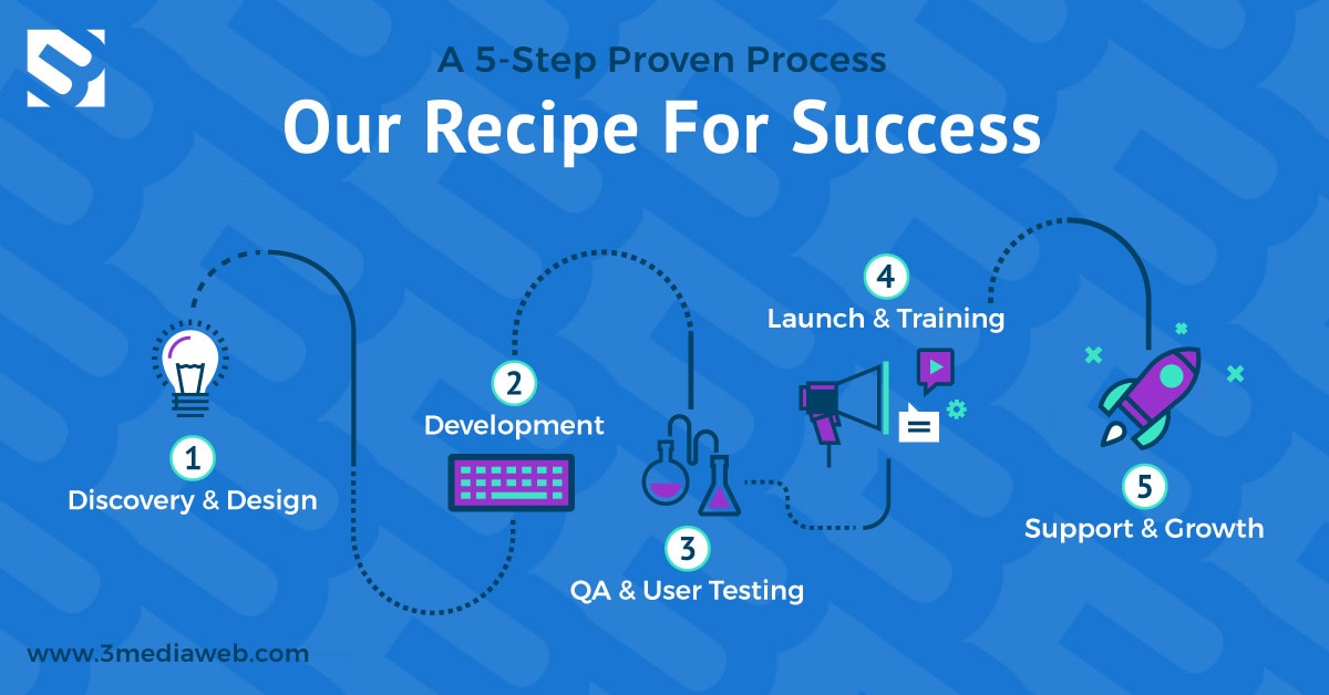
On rare occasions, when clients choose not to follow our process, a project can slightly or even completely go off the rails.
In this case, it happened, and this is our story.
It was time to revamp the 3 Media Web site to reflect its current full-service digital web agency offerings. Anyone who has been through this process knows a new website can involve rebranding, extensive planning, and a significant timeline.
By implementing our 5-Step Proven Process, we avoid the many pitfalls and pain points on large-scale web projects when working on our client’s websites. As long as our team and the client stick to the process, our web projects run on time and within budget.
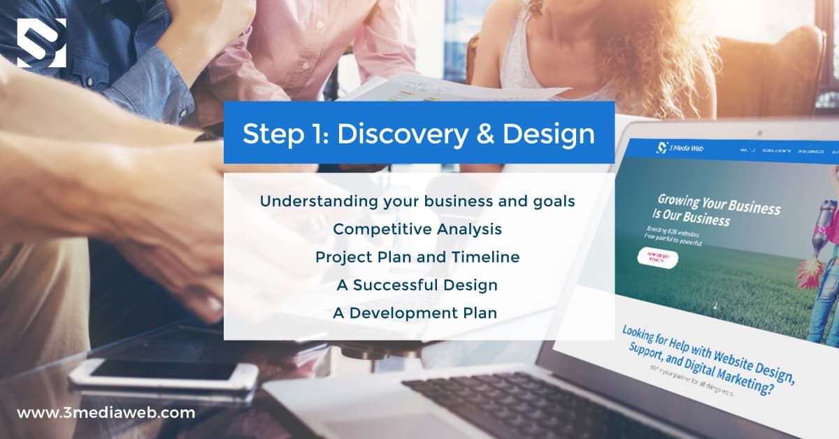
Step #1 of our 5-Step Proven Process is discovery and design. Discovery allows our team to start from square one with a client. Our team understands the client and their industry and learns of their biggest marketing roadblocks and top-lying goals. Based on initial discovery meetings, a new site structure and design are crafted.
In the case of our own website, we made the mistake of skipping our vital discovery process (something we tell clients never to do).
We figured, “Hey, we are the experts we can refresh our current website” (BAD IDEA).
To start, this meant just adding some new content to the current site with a slight design improvement. Once we started mocking up designs, we realized we needed a better sitemap, content plan, and rebranding.
We spent months on the newly designed “refresh,” but after reviewing the design with our team, we realized we were still missing many pieces to the puzzle.
EPIC FAIL #1 Discovery
We skipped our own Discovery Process. We say we do our homework, but we failed to do it for ourselves.
Our strategy for designing a successful website starts with client collaboration. During the discovery process, our team works with the client to define the website’s creative strategy. We conduct a thorough, industry-competitive analysis.
We create an overall project plan, including a project timeline, to ensure the project process stays on schedule. Discovery allows us to ensure success with the site’s overall design and client presentation. It increases our success in hitting the target with a website overhaul. It uncovers all of the required elements identified during the discovery process.
“We did not do any of this for ourselves.”
It wasn’t until after we designed a new version of our site that we realized we really didn’t do our homework. This added to the timeline of the project as we took a step back. We needed to do some competitive industry analysis, not just with design but with content and branding. So we went back to the drawing board to perform some information architecture, create a detailed UI mock-up, and improve our overall design.
Updating the site’s structure forced us to look at how we would present our various distinct service offerings. We wanted to keep the site simple but focused on our core service offerings without cluttering up the navigation bar and confusing the user. To keep it simple, a landing page was created for two main service sections, and related service subpages were grouped under those.
The goal: to reach two different audiences. One seeking out web services such as design, development, and support, and those looking for a growth partner.
In addition, to keep the site simple, clean, and easy to use, the only other navigational main pages we added were an About Page, Projects, Contact, and Blog.
The goal of having the two service offerings front and center was to avoid confusion and direct the user to where they need to go for more information. It also helps cross-market our extended offerings as a full-service digital agency.
The argument against this format was the use of an extra click to get to a service. In the end, we felt organizing it into subpages and using drop-downs was the most efficient way to find valuable targeted information. It would also allow us better to target our audiences on Google AdWords and Organic Search.
After the second round of design and navigational changes, we finally handed our design to the development team.
What We Learned
“Never skip the discovery process.”
Discovery is the key to success in any web design and development project. Skipping over key processes will only lead to failure down the line.
EPIC FAIL #2 Post Development Changes
As mentioned above, once the site goes to the development team, the design is complete and reflects the expected final product. If a client changes the design after the development phase, this is typically (but not always) a setback both with time and budget. So it is our goal to have the client sign off on the design, along with some fine-tuning and perfecting of the functional specification document (a comprehensive roadmap of how the website will technically work), for our development team.
Once the design and functional specifications are approved, our team produces an HTML prototype, a coded design that will later be implemented onto custom templates.
When our website design mockups were built, we had just finished building an accessible website for a client. We decided that since we were redesigning our own website, we should also make it accessible. We also wanted to offer a website that appealed to the largest audience possible, including users with vision impairments.
With that, we had to move back into the design phase and redesign the site to meet accessibility guidelines.
This took a lot of extra time, at least a month before we could complete an accessible web design, which meant we had to take a step back for the site’s templates and review and change our technical specifications.
Web accessibility should have been addressed in the discovery phase, but because it was such a recent trend in web design, we didn’t think about it when scoping out our own project.
What We Learned
Building accessibility into each site we develop is now something we always strive to work towards. For a fully accessible designation, we have resources (time and money) for this. We will still work towards basic accessibility considerations during the design process if it is out of reach budget-wise for the client. It is now part of what we do.
.
Epic Fail #3 Development
Fortunately, after the second round of design changes, our senior project manager developed a revised functional specification that kept the development process on track. From this point, development was smooth sailing.
Many of our new functional features required updated content. We added functionality such as rollovers and new categories. Still, We had not thought about the new text needed to go along with the new features since we had already completed our web copy (and you can guess who acquired that tireless job).
We also need to create new graphics for the site, but again we did not address that in the design process and instead started designing most of the graphics after the site was developed. This approach slowed down the process of content development and page creation.
What We Learned
Again, don’t skip the formal discovery process.
Discovery is what leads to success in both the design and the overall development of the project. Doing your homework up-front uncovers all of the functionality needed on the website to provide the development team with technical specifications that will avoid missing any features in the development process.
It takes more work to go back and add missing functionality and revised content once the site has been developed. Because our development process is somewhat flexible, we could go back and add them in, but that led to a longer timeline for launching the project.
Epic Fail #4 QA
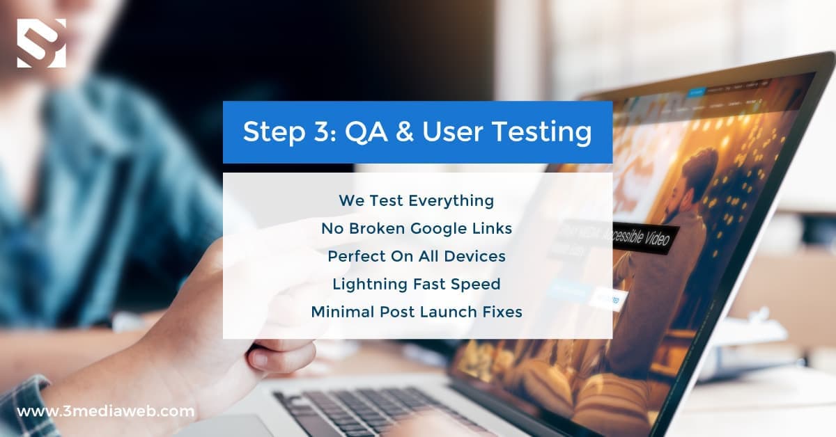
QA (Quality Assurance) is Step #4 in our 5-Step Proven Process. Usually, we spend at least two weeks doing internal QA and making all the fixes we find on our development server. We test and test again before we send a final link out to our clients. By the time our clients receive a pre-launch tested site, the only fixes that should be found are content-related and up to the client’s discretion. We make time for that and plan that into our process.
We never set up a projected project timeline (epic fail) on our own project, but we were hoping to soft-launch our site by July.
That never happened.
We were close, though, very, very close, and in all honesty, we just got busy with client work, and again, our number one sales and marketing tool fell off the map.
In mid-August, we confirmed that we would be presenting at the upcoming Agency Automation 2018 the first week of September. This put a hard date for the launch of our website. We were determined to launch, which meant we would have to finish last-minute content and development changes. This took a couple of weeks, leaving us only a week for our QA process.
It was the last week of August, and we still had not seen the website launch, with the event to happen on the following Monday.
How do you launch a site in a rush?? Skip QA!!! (No, really, don’t do it!).
Luckily, since the project took so long, we had gone through several steps of QA already, and we were confident that the website launch could happen first thing on Monday morning.
We would never do this for a client, but we had control over it, and we decided to do it for ourselves. If anything bad was to happen, we had the team ready to make the necessary fixes.
On Monday, we launched the site with no hiccups. Our ongoing QA process was thorough enough to avoid any issues.
The site was migrated seamlessly without a hitch, and our new rockstar website was now live.
Technically, our QA process was not an epic fail, but it failed to stick to our process to launch seamless websites.
Thankfully, because we were already the worst client ever, it didn’t really matter.
#EPIC SUCCESS #5 Growth + Support
Our 5-Step Proven Process includes growth and support of your newly launched website.
We are big believers in “always be improving.”
This goes into everything we do, including our own website.
Many clients think,” my website is done; I am done working on it.” But in all truth, you don’t really know how visitors will interact with your new website until you have some data around that.
By looking at ongoing site data and analytics, a site can be continually improved. This could include improving top visited pages, top exited pages, time on site, bounce rates, and more.
A website launch does not mean you stop working on it. It means you continue to improve the experience for your clients. After three months, this could mean changing things up if certain features or content aren’t delivering results, converting, or working as expected.
One example of improving a piece of the newly built site was how we presented our client portfolio and success stories. Originally, we created “abstract-looking” thumbnails for our portfolio page. We thought that would be cool and trendy. But this is also an example of design vs. function. The thumbnails we designed were purely for visual and design appeal.
What we realized from our data was that people were exiting our portfolio page sooner than we wanted. We examined why that might be and concluded that maybe we were not exposing the brands or verticals that clients wanted to see, causing them to leave.
If a “look-alike” potential customer is skimming our site to see what brands and verticals we worked with, they would have to drill down, click on the thumbnail to find out who that project was for and how it looked. We were making them do more work than necessary.
We ended up redesigning the thumbnails to include a client logo that could be seen immediately upon landing on our portfolio page. This has lowered our exit rate from that page and kept the visitors on the site longer with an extra click to explore more about that project.
Our improvement to that page is keeping visitors on our site longer and viewing more pages.
Research tells us that B2B customers progress more than 70% through the website launch decision-making process before ever engaging a sales representative, so we want to make sure we are steering them in the right direction while they do their research. This makes improving your website even more important when your goal is to generate more leads from it.
Most B2B buyers say they rely heavily on white papers (82%), webinars (78%), and case studies (73%) to make purchasing decisions. Close behind are e-books (67%), infographics (66%), and blog posts (66%).
Having a partner to support any website launch to help grow and improve your business is crucial to ongoing success.
We know because following Step #5 of our process has helped us improve and generate more qualified leads from our website launch.

