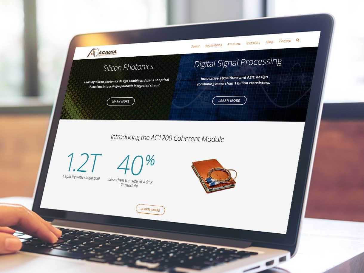
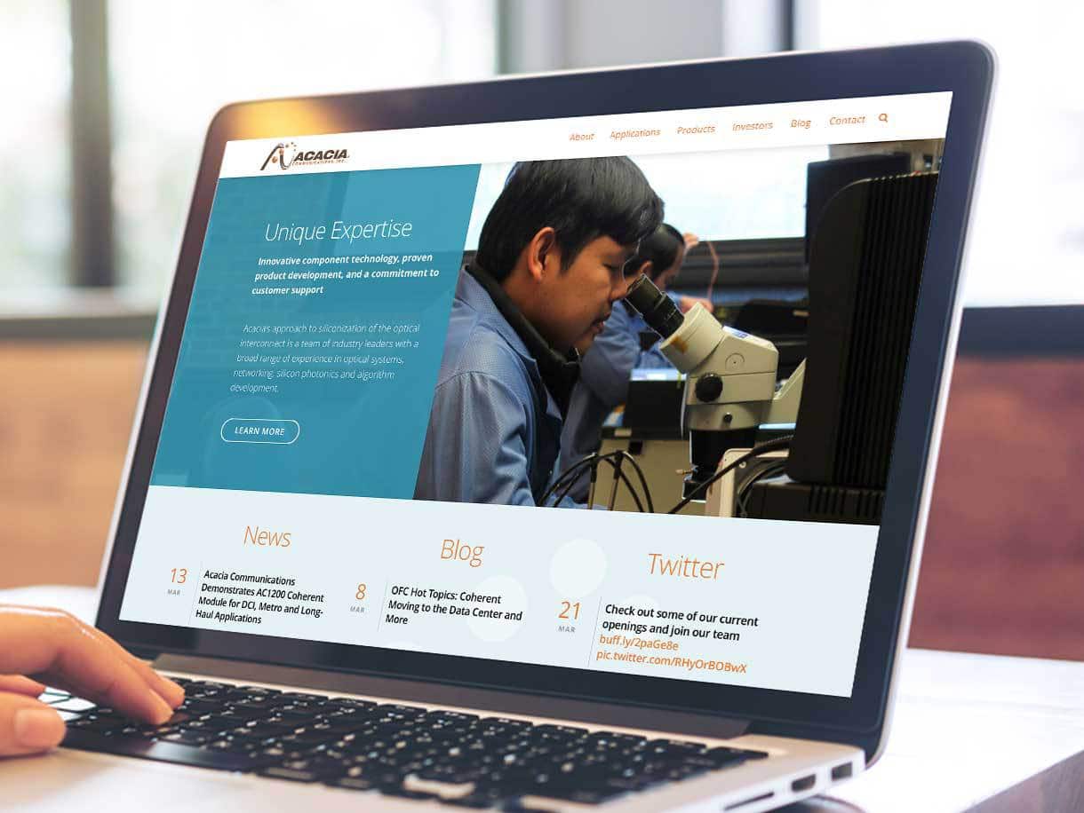
Acacia Communications Inc. is a leading optical networking technology company that empowers cloud and content providers to connect at the speed of light, enabling them to meet the rapidly increasing consumer demands for data. Acacia has leveraged advances in silicon processing to provide their clients with higher data transmission rates, lower power, and higher performance.
Key Goals for the Website Achieved
Acacia Communications’ select list of high-end enterprise level clients required complex network interconnectivity and reliability. Their new website presents the company’s comprehensive content in an updated and streamlined format to increase clarity for clients, prospects, and potential investors.

Acacia Communications is located in what used to be the Assabet Woolen Mill, repurposed in a contemporary and trendy style to be the headquarters of Digital Equipment and Monster.com. Now home to Acacia Communications, the updated offices are known as “Mill and Main.” It was important that the new website match the corporate image of the company and its offices, especially for recruitment purposes.
A primary goal was an updated design and new dynamic features that complement the high-end nature of the business and support the company’s reputation as a leader in the telecom industry. 3 Media Web redesigned the Acacia Communications website using a new color palette and a streamlined layout. The design includes an easy-to-follow navigation with major tabs at the top and a sub-menu on the left side of the screen.
Responsive Design
The new website is responsive and easily navigable on all devices. An important feature of the website is the “hamburger” menu icon at the top of the screen as well as on the bottom left navigation bar to ensure that users never lose their way through the content-rich site, including the financial information within the Investors section.
A Focus on Strategic Website Pages
To differentiate Acacia from its competition, the About Us page includes a carousel of Competitive Strengths text superimposed over a colorful background image of the Acacia laboratory to attract and engage the reader. The technical content speaks to key decision-makers within their very specific target markets.
An engaging video, featuring the capabilities of Acacia Communications was added to the About Us page which can also be accessed on YouTube. 3 Media Web added a large, enhanced still image to introduce the video. We also created a custom play button for this video and others on the site to harmonize with the new website design.

The 3 Media Web redesign of the Product page includes images of the products and a puzzle graphic that reiterates the company’s Four Key Capabilities, also shown with animation on the About Us page.
Likewise, the Home page, Resources, Applications, and BLOG pages were redesigned to be dynamic, simulating data streaming and supporting the assertion that Acacia Communication is a company on the cutting edge of high-speed integrated optical networks.
Hundreds of Resources Repurposed
The former Acacia Communications website had a wealth of information for web visitors that often linked to external resources. The page needed to be restructured so that this information could be managed on the back-end more efficiently and reside on the website. Resources were rearranged into a new visually-appealing design using 3 Media Web sourced images. We created PDFs and are now hosted on the Acacia website. Videos are displayed on-site with an optional link to YouTube.
A Simplified, More Efficient BLOG
The new 3 Media Web layout uses large images and teaser content to link to each BLOG article, making it easier for the user to scan the page and find articles of interest. A “hover” feature was used where the image advances forward to engage the reader. To aid in accessibility, the entire image, as well as the title and teaser text, links to the article.

Recruiting a Young Talent Pool for Key Positions
In addition, 3 Media Web redesigned a Careers section that appeals to a younger, tech-savvy talent pool that the client wants to recruit for its growing company. Key language is used to engage prospects and a pop-up Call to Action burst links to current openings and an application form.
Addressing Investor Potential
3 Media Web rebranded the investor portal which seamlessly brings potential investors to a NASDAQ sub-site with a design consistent with the new Acacia website. A major undertaking, all HTML pages, headers, footers, and design elements of the new website were supplied to NASDAQ so they could be integrated into the sub-site with all functions operating properly.
The Acacia Communications website has been redesigned to engage high-tech prospects from a range of target industries … the design and content supporting its reputation as a leader in the field of optical networking technology.
