Almost 80 years ago, Abraham Ogan started a business selling bread and doughnut mixes to local bakeries. He called his business Bake’n Joy. Nowadays, the business is operated by Abrahams’s grandson, Robert Ogan. The business Abraham created with nothing more than himself, and a single blender has grown into a thriving nationwide business.
Bake’n Joy now sells mixes and baked goods for companies in sectors ranging from convenience stores, educational institutions, hospitals, and other businesses in the hospitality industry.
In other words, the company has evolved over the years in response to consumer trends and provides high-quality products to busy bakers. They offer over 450 products, including Predeposited Muffins, Scoop & Bake Batters, Mixes and Bases, Fillings and Toppings, and Thaw & Serve products. Perfect for customers who want high-quality and ready-made products.
The Challenge Of Keeping Up A Website For A Growing Business
When Bake’n Joy approached us here at 3 Media Web, they needed to update their website to accommodate its growth. After meeting with Bake’n Joy representatives, our team established a few main goals that drive their website redesign.
They were:
- More professional look
- Improved navigational design of their more than 12 product categories
- New layout to feature all eight Bake’n Joy brands
Another important factor was showing all of their products–not just an overview of their offerings. This was a huge aspect of this project and the main driving factor for updating their website in the first place.
And with that, a plan was established, and a timeframe was developed to knock this massive undertaking out of the park for Bake’N Joy.
Completing A Major Website Redesign For Bake’N Joy
The first thing we did with Bake’N Joy and with all clients, is to discuss their brand and needs. This important step in the process is part of the discovery phase.
It helps us fully understand what the client wants and expects and allows us to present any additional changes to improve the final product’s success further.
During the discovery phase, we assessed the issues and developed a plan to correct them. From there, we started implementing our plan, being sure to stay in close contact with Bake’n Joy throughout the process to keep them updated and providing feedback.
Here’s how we did it:
Updating To A More Streamlined & Professional Design
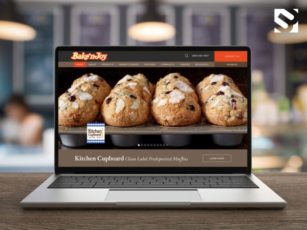
First things first, we made some changes to the Home page design. Our designers set out to achieve a sleek, professional look, free from the distraction of background patterns. This way, the visitors’ attention stays on the client’s product, not the background.

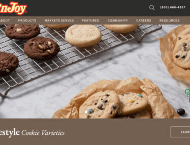
Additionally, the client provided images of their delicious products that nearly induce the salivary glands into action. To show off these mouthwatering goods, we replaced the imagery on the site with the new, close-up images to highlight the Bake’n Joy brand.
Further, the new design our team came up with saw the removal of outdated cartoon images. Instead, we replaced them with high-quality photos to enhance the professional appearance desired.
Target Products or Browse with Uncomplicated Navigation
Next on the agenda was to make improvements to the navigation menu. Because of the importance of a good navigation system and the client’s expansive inventory, we had our work cut out for us.
Despite the challenge, we came up with a perfect solution.
3 Media Web created the main navigation bar with a Products tab. There is a large megamenu under the Products tab, featuring the categories of products and the Bake’n Joy brands.
This simplifies the site’s navigability by allowing visitors to easily access a side menu listing product categories and brands via a quick click on the Products overview header.
To further simplify it for the visitor and improve the user experience, we also added thumbnail images of each of its product categories.
In both cases, visitors can browse products and drill down to product details on interior pages. On top of that, an accordion chart was added for each product that includes a thumbnail image along with the item number, name, weight, and volume size.
Each product in the chart links to a full description, providing an easy road map for the reader to follow.
Home Page Features
When working on website redesigns, we always make it a point to build websites that are accessible and usable to our clients. We also provide training for our clients to make sure we’ve set them and their new site up for success.
That’s why when we designed the home page, 3 Media Web made sure to include banners that the client can update as needed.
One banner features Bake’n Joy’s exclusive distributorship of a new gluten-free product, and another announces a new Filled Muffin category. The call-to-action button links to interior pages with additional information. All of which can be updated by our client with ease.
Scrolling down, the reader is captivated by the logos of the company’s brands, all of which link to the interior brand page. This page displays each of the categories, which are linked to the accordion chart. It makes it easy for visitors to access any of Bake’N Joy’s products.
Meanwhile, another section on the Home page includes links to articles on Industry Trends, Company News, the Bake’n Joy Facebook page, and a call-to-action encouraging visitors to subscribe to the company newsletter.
All in all, we put a lot of detail into ensuring the new Bake’N Joy site flowed well and brought visitors where they want to be.
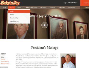
Another example is how we included an introduction to information about Bake’n Joy on the home page. We added some short copy that supports their professional, long-standing reputation as a family-owned business that links to their About section with the President’s Message and the company’s Culture and Values.

Showcasing Bake’N Joy’s Amazing History Via The About Page
Speaking of the About page, this portion of the redesign allowed us to showcase Bake’N Joy’s rich history using modern web design.
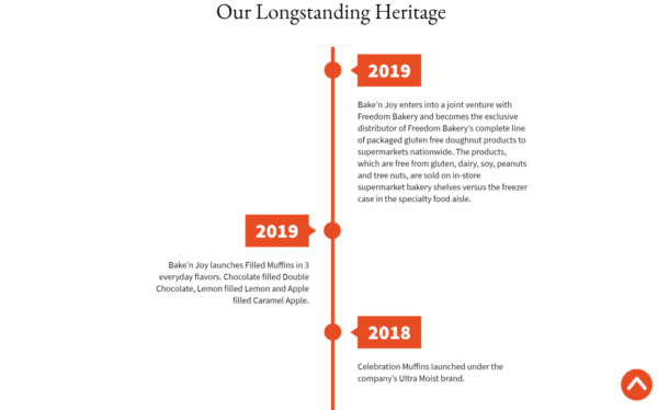
We added a fun and interactive animated timeline that highlights some benchmark activities since Bake’n Joy was founded in 1941.
To enhance the page’s visual appeal and help draw visitors into the story, we add vintage photographs to accompany text that details the history of the company.

Improving Website Navigation With Featured Tabs
Another improvement we made to the navigation menu was adding a Featured tab on the main menu. The Featured tab includes individual, animated banners for new and featured products. These can be changed out easily by the client and provides them an opportunity to show off their scrumptious products with beautiful photos.
A Community tab was added, including blocks of text and images to highlight company news and social media posts. The Community tab is also to company events, including Bake’N Joy’s trade show schedule for the year.
And we didn’t stop there!
3 Media Web also designed a Resources section, adding to the improved navigation menu. It’s home to a robust collection of product information, including:
- videos on product handling
- recipe how-tos
- and market data with industrial insights
In addition, this section includes infographics on trends in the marketplace and a page for the Freedom Gluten Free™ brand they distribute.

To help visitors find answers quickly, 3 Media Web also added a FAQ accordion that rounds the page out.
How A Website Redesign Gives Back Big Returns For Bake’N Joy
With the completion of this large-scale project, 3 Media Web delivered a new, streamlined website that reflects the growth of Bake’n Joy. Importantly, it provides a clean, easy-to-navigate journey for the website visitor, who can quickly arrive at content specific to the retail and food services industries.
As a result, visitors to Bake’N Joy will have a dramatically improved user experience. Because of this, we expect Bake’N Joy to enjoy an increase in leads as well as sales.
If you’re interested in increasing sales on your company website, contact 3 Media Web today to chat with one of our experts.

