Is the content on your b2b website focused on lead generation? If so, you’ve got a lot in common with many marketers. Unfortunately, this practice is likely costing you precious B2B Sales.
Of course, attracting new leads is an important part of B2B marketing, but it certainly isn’t the only component, nor is it necessarily the most important.
Today, we’re going beyond the basics of lead generation and focusing on how you can improve your B2B website to convert those leads into sales.
Two Determining Factors Of A Website That Successfully Converts B2B Sales
When potential clients ask what we can do to help their website perform better, one of the first things we do in our 5-step process is run various evaluations.
During this initial phase, we look at their existing B2B website. On the surface, there are a couple of aspects we pay close attention to:
The content. This includes page copy, blog posts, images, video, graphics, and other visual and audible elements.
Another thing you should be looking at, and it’s a big one, is:
The design. Your website is often the first impression people receive of your business. If it isn’t a good impression, well, you can guess how that goes…
These two baseline factors can single-handedly make or break the success of your B2B website.
But…
Website Design Is Just As Important To Make B2B Sales As Content
It might be frustrating, but the reality is humans like to look at pretty things, and your B2B website is no exception.
“Consumers ranked display (65 percent) as the most important aspect when it comes to content experience in their personal life, and 54 percent listed overall good design, such as appealing layout and photography as important.” —Adobe State of Content Report
In a recent State of the Content report, Adobe discovered nearly 60 percent of global consumers prefer a website that is engaging and beautifully designed instead of rather simple and plain.
The key takeaway?
First impressions matter. A Lot.
When it comes to your B2B website, first impressions often make the difference between losing a lead or converting it.
Good design, of course, works hand in hand with good content.
So, don’t settle for just one or the other–aims to do both.
First Things First: Define Your Company & Audience
Before we dive into creating content and brainstorming new design ideas, you’ll first need to define a few things about your company, your audience, as well as what you want from your B2B website.
Grab a piece of paper and pen and jot down the answers to the following questions:
- What industry does your B2B operate in?
Are you in pharmaceuticals, manufacturing, telecommunications, etc…Narrow it down as much as possible so you can more clearly define your target audience. - Define your target audience.
What other businesses would find your products and/or services useful? You’ll use this info to determine if they will find your content useful, too! - What is the goal of your website?
Since you’re reading this article, your goal is likely to boost B2B sales, but list any other goals you’d like for your website to accomplish. Some examples could be gathering emails, building a community, providing product tutorials, and so forth.
Great! Now, keep the answers close by as we continue so you can reference them in the following steps.
Now sure how to get started with your brand strategy, let alone your web design? The award-winning team at 3 Media Web is here to help.
How To Evaluate Your B2B Website Design
Over the past decade or so, the internet has become a competitive landscape for B2B companies.
Just having a website isn’t enough.
When a potential client reaches your website, how well it represents your company and its products and/or services determines whether or not the lead stays longer or moves on to another destination.
I have some more questions for you to answer, but before I do, a word of advice…

The design of your website can mean the difference between making a B2B sale or not.
As you answer the questions, be unbiased and answer as honestly as possible. The best way to do this is to look at your website from a customer’s perspective.
So, go ahead and put yourself in your client’s shoes, and we’ll walk through the steps together.
Look at your website as a whole and ask yourself the following questions:
What Is The Overall Design Like?
We’ve already discussed just how important design is, and now it’s time to take a good hard look at the design of your B2B website.
Does the design of your site look professional and aesthetically pleasing?
Let’s look at an example of a good professional design. We recently did a website redesign for a B2B called Acacia Communications.
Working with Acacia, we developed a clean design that clearly represented the company and its position in a tech-driven industry.
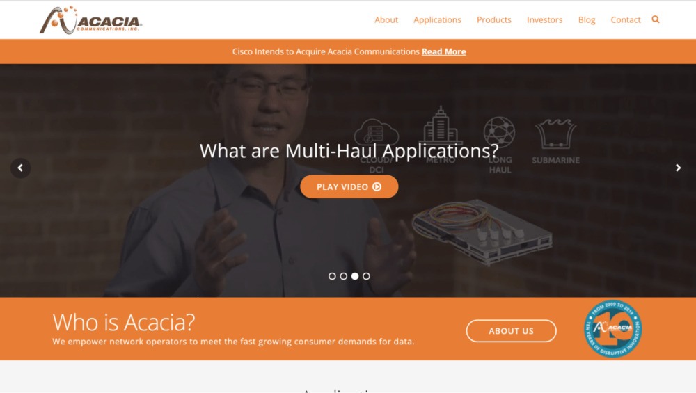
3 Media Web transformed Acacia Communications site into a B2B sales machine.
The colors, the visible logo, and even the images all communicate and instill the brand’s identity.
Customers aren’t inundated with too much data and copy. The design is sleek, modern, and not too busy in appearance.
Notice the section near the bottom of the screenshot that asks: “Who is Acacia?”
Right away, it’s made clear to visitors who the brand is and what problems they can solve for clients. The design is such that customers don’t need to scroll endlessly and click through several pages to ensure they’ve come to the right page.
The placement of that copy is critical, too, which leads us to the next question…
Is It Easy To Navigate And Find Information?
Is it easy for visitors to your site to find the information they are looking for, and is your website simple to navigate?
Acacia Communications understood the value of having a modern B2B website designed with their customers in mind. The site was designed with the navigation bar fixed to the top of the page–and it stays there as you scroll.
That makes it easy for customers to find the pages they need.
Can you say the same about your site?

Make sure visitors to your B2B website can quickly and easily find what they are looking for.
Additionally, as you scroll down their homepage a bit more, visitors are shown information that answers some of the most frequently asked questions their customers may have.
Their products are introduced, showing what they can all be used for without ever clicking a link.
In doing so, they are assuring visitors stay on their site rather than becoming frustrated and leaving the site because they couldn’t find the information they were looking for.
If you think a user will spend time digging around your site to find what they want–think again! Think With Google reported 61% of people would leave a site if they don’t find what they’re looking for right away.
And it gets tougher…
According to Taylor and Francis, your website has about 50 milliseconds to make a good impression before the average user clicks off the site…Yikes!

Your B2B website has about 50 milliseconds to make a good impression.
How Old Is The Design?
The age of your B2B website is somewhat of a double-edged sword since both the design and content could be crippling your lead conversion rate.
Let’s start with the design aspect of an old website. Primarily, how responsive the design is.
Long story short, there are over three billion smartphone users globally. And, more importantly, nearly 50 percent of B2B researchers use mobile devices for product research.
And there’s no sign of the migration to mobile use in B2B research slowing down…
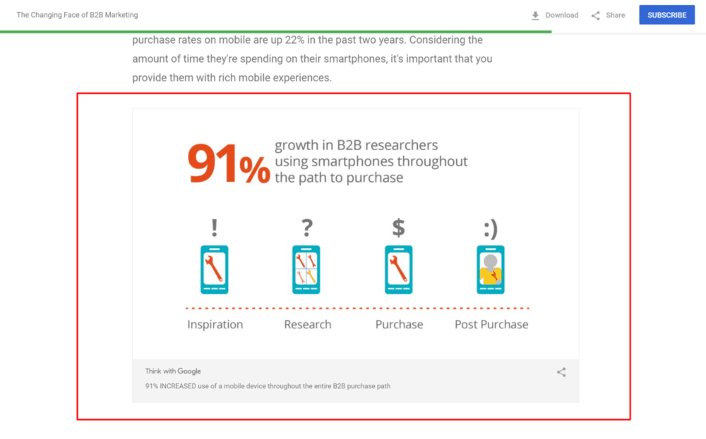
Google surveyed over 3000 B2B researchers and found a staggering 91-percent increase in the number of people who use a smartphone during the path to purchase.
In addition to your B2B site looking good when viewed on a computer, it must display properly on a mobile device as well!
That means responsive web design is more important than ever for effective lead generation and B2B sales conversions.
What Is Responsive Design?

Especially with Google’s latest ranking algorithms, responsive design is more important than ever for B2B websites.
Responsive web design ensures that your website displays properly across all browsers and devices, be it a laptop, desktop computer, iPad, or smartphone.
The beauty of the responsive design is that it detects what kind of device a visitor is using and automatically optimizes your site for the best viewing based on the device.
For example, we saw what Acacia’s site looked like on a desktop in the screenshots above. But when you visit their site on mobile, it looks like this:

As you can see, the mobile view is more compact. To keep things looking tidy on a small screen, the navigation bar is accessed by tapping the three lines in the upper right-hand corner.
On top of that, the text is large and readable without having to be zoomed in on.
Because over 60-percent of searches come from mobile devices, having a mobile-optimized site means opening the doors to more leads that will come to you from smaller devices.
In fact, a mobile-ready site will rank higher in Google search results than one that is not. Blue Corona found sites that were not mobile-ready were slammed by a 50-percent reduction in organic traffic since Google officially announced their decision to rank mobile-ready pages higher.
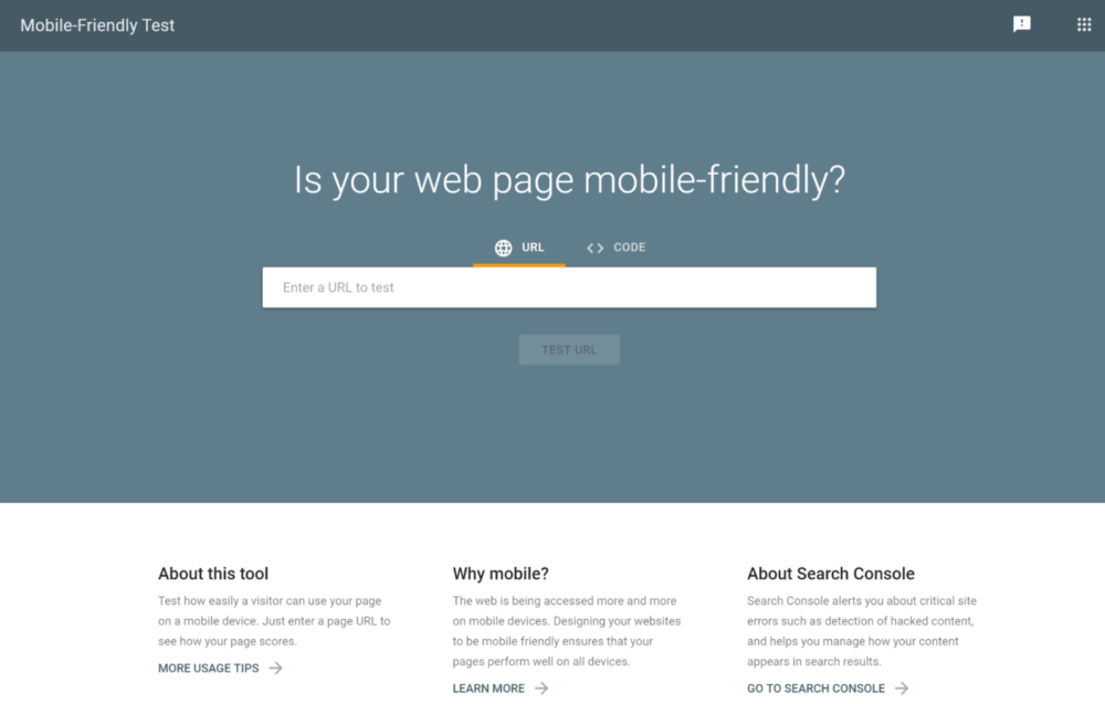
You can test your site’s mobile readiness on Google directly.
As you’re looking at ways to increase sales on your B2B site, prioritize optimizing your site for mobile viewing.
Is Aged Content Limiting B2B Sales On Your Website?
Much like the design of your site, old copy is also a major factor in determining how well your B2B site converts leads to sales.
When was the last time you updated the content on your site?
Do the copy and imagery adequately showcase your brand and reflect your company’s current ideology?
In addition to brand messaging, ensure all your current product and service offerings are shown on your site. It’s easy to forget about updating your website when you’re busy dealing with the real-world aspects of a new product launch.

Update the content on your B2B site regularly to reflect changes in your messaging and product offerings.
However, if visitors to your site aren’t aware of the services you provide, it’s going to make it pretty hard for them to purchase them on your website!
Content Is Still King — Especially When It Comes To A B2B Website
There’s a saying in the digital marketing world; maybe you’ve heard it…
Content is king.
In addition to the design, content is one of the most important elements of a website.
Today’s marketplace is fast-paced and highly competitive. B2B researchers seeking information on products and services want to find what they need easily and fast.
Nine out of 10 website visitors will leave your site if the content doesn’t provide the information they seek.

Look at the copy on your site.
Does it provide enticing, informative content about your company?
What about products and services?
Don’t forget about additional consequential information that differentiates yourself from your competitors.
All these things serve to keep visitors on your B2B website and subsequently convert leads into sales.
Three Things Your Content Needs To Have To Boost Your B2B Sales
The types of content you’ll find on a B2B website are plentiful.
The copy on your homepage and landing pages, for example, is one type of content great B2B website designers pay special attention to.
It has to be concise–punchy enough to grab a viewer’s attention immediately.

Short scannable content with objective language is the core of great B2B content.
A recent Nielsen report proved copy which employed these three writing techniques boasted a 124-percent increase in usability:
- concise wording
- objective language
- and scannable content
That means, when you’re creating copy for your site, you need to get to the point quickly if you hope to convert that lead to a sale.
There’s More To B2B Content Than Just Page Copy
Okay, so page copy should be short and sweet. But what about other types of content?
We mentioned how vast the realm of content runs before, but what types work best to make sales?
3 Media Web Director of Operations, Sara Spector-Brown, wrote a great guide on generating sales lead with B2B content. In it, she suggests offering more valuable types of content on your site as well.
According to Bobby Calder, a marketing professor at Kellogg School, a branded blog, ultimate guides, eBooks, and whitepapers result in more leads and more B2B sales than in-person events like conferences.

Having a variety of authoritative content on your website builds trust and B2B sales.
Calder recently conducted a pretty interesting study examining the usefulness of content marketing to B2Bs.
Calder told Kellogg Insights:
“With content marketing, you’re not so much trying to communicate value as to create value beyond the product.”
That’s why creating longer content and creating regular blog posts leads to so many sales. If your content can solve your customer’s pain points without buying anything, they’ll build confidence and trust in your brand, making them more likely to convert to a paying customer.
See how that works?
Short, concise page copy that’s supplemented with longer-form content like whitepapers, a blog, and even webinars and explanatory videos are the perfect combination to drive more B2B sales.
Beyond B2B Sales, Quality Content Is Also Great For Gathering Information
Because a large majority of web traffic could come from unsourced leads, you’ll want to collect customer data so that you can further pursue them.

B2B content on your site works to make more B2B sales and improve other aspects of your digital marketing strategy, such as email lists.
You can do this via forms, but you’ll need to entice the B2B researchers to fill them out.
That’s easier said than done, but not impossible.
In fact, you can use the content on your B2B website as an incentive for filling out the form or survey. This is sometimes called “gated content,” which means a step (the gate) a visitor must complete getting the content.
If you’re trying to build out your email marketing list, for example, offer them something of value, such as a whitepaper on interesting industry information, an e-book, an infographic, etc.,
Try to find out what problems your customers are having and provide a solution to it.
SurveyMonkey recommends you create a custom landing page backed by a marketing automation tool that will track the signups your content gets.
Additionally, their ultimate guide on using surveys suggests keeping your survey short–under 25 questions.
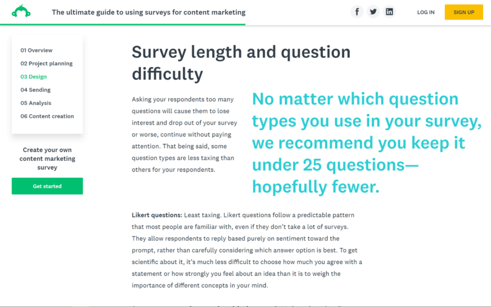
The shorter the survey, the more willing B2B researchers are to take the time to complete it. Make every question count!
And we’d suggest keeping it much shorter than that–stick to just 5 or so fields whenever possible.
You Can’t Make B2B Sales If People Can’t Find Your Website
According to Google, over 70 percent of B2B researchers start to research products and services they are interested in with a generic Google search.
That means they’re not just typing in your web address and visiting your site.
A strong Internet presence and reputable B2B website will boost your page rankings on major search engines. This ensures that leads find you first before they find a competitor.
Not to mention, it’s next to impossible to make B2B sales with your website if no one is finding it in the first place!
SEO For Your B2B Website
Making your website content search engine optimized is critical to improving search engine visibility. The best way to do this is to sit down and create a Search Engine Optimization (SEO) strategy for your B2B website.
Many marketers think using keywords around a B2B site constitutes optimization, but SEO is a complex and evolving set of protocols.
We even wrote a primer on SEO with B2B’s in mind. We suggest you start there.
Build Your B2B Website for Both New and Current Clients
A website that’s developed with the sole aim of attracting new clients won’t help you much with customer retention or making B2B sales.
Consider both short-term prospects and potentially loyal future customers. Repeat business is a lot better for your ROI than a one-time purchase!
A website that continues to offer relevant information and expert industry knowledge provides ongoing value to your clients. On top of that, it fosters brand awareness.
Remember, look at your website from the perspective of your clients.
- What is it you’d like to see if you were the one seeking information?
- What problems would you be looking to solve?
- Does your current website satisfy those two things?
Answer those questions first, and you can begin designing the blueprint for a great B2B website.

A website that converts leads to B2B sales takes forethought, planning, and expertise.
The Bottom Line: Treat Your B2B Website Like It’s Your Best Salesperson
Why? Because it may be the first and only “salesperson” potential clients ever deal with in any capacity.
In summary, your website should be designed to reflect your brand, showcase your products and services and, essentially, explain to the B2B researcher why they should choose you over a competitor.
You can use several other metrics to level up your B2B sales outside of design and quality content.
Please take a look at our Digital Marketing Strategy whitepaper, then shoot us a message to learn more about how 3 Media Web can help you modernize your B2B website and convert leads into sales!

