Marketing teams often spend their time trying to increase traffic to their website, but traffic is only the beginning. The real goal is lead generation, turning out high-value qualified leads for the business from those website visitors.
To drive real value to your business, you need a lead generation strategy that engages visitors, builds your knowledge base of customers, and converts more people along the marketing funnel.
Learn how 3 Media Web tackles lead generation strategies for our clients to pick up a few helpful tips for your digital marketing goals.
What is lead generation?
A lead is a person who has shown interest in your business. Lead generation is the method of identifying and converting users into prospects for your company.
The general process is when a user clicks on a call-to-action button from a marketing channel that takes them to a landing page to entice them to fill out a form in exchange for an offer, at which they become a lead.
Types of Leads
There are different types of leads, which are Marketing Qualified Leads (MQLs) and Sales Qualified Leads (SQLs).
- Marketing Qualified Leads: Users who have engaged with your marketing assets but are not ready for a sales call
- Sales Qualified Leads: Users who are interested in becoming a customer
A Persona-Driven Lead Generation Strategy
A lead generation strategy is a plan of tactics to convert prospects into leads in hopes of encouraging them to become a customer. Not all leads are created equal depending on whether they are an MQL or SQL. The key is to know your audience and what drives them to drive down the marketing funnel.
Build personas on the type of people that are more likely to be ready to convert, identify which marketing channels would best reach them, and set goals that are tangible and measured against them. Finding the secret sauce to gain quality leads will take trial and error.
Top 5 ways to generate leads through digital marketing:
1. Gated content
Gated content is digital content offered in exchange for users identifying themselves by filling out a form. This tactic is the most common because of its effectiveness in giving something of value for free as long as the user will provide their information to be contacted further.
- Free Trials
- Demos
- Blogs
- White papers
- eBooks
- Guides
- Reports
- Online tools
2. Social Lead Generation ads and remarketing
- Social media is a highly effective tool for lead generation because of the ability to specifically target people’s demographics, companies, and job titles and even upload prospect lists to target email addresses.
- Once the algorithm has been fed to the users to target you can then customize look-alike audiences that are people who are similar to those you’ve been targeting to advertise to.
- Remarketing is your best friend for lead generation because it drives results. Remarketing is a feature on paid advertising platforms that allows you to show your ads to people who have interacted with your content in the past to offer incentives.
- Choose the right social media platform based on where your audience is most likely to frequent.
3. Email Marketing
- Email lists are one of your greatest marketing assets because you already have their contact information, so use personalized emails to reel them in and provide an irresistible offer.
- The average ROI for email marketing is $42 for every$1 spent.
- Nurture your leads with timely emails to keep your business on their mind and motivate them to take action
4. Incentives
- The simplest method to lead generation is essentially bribery. In this day in age, people do not like giving out their personal information, so offering incentives will entice people more.
- However, be sure only to offer incentives to your target audience. You can end up with a lot of unqualified leads.
- Incentive ideas:
- Contests with prizes
- Discount Codes
- Free Merchandise
- Product add-ons
- Free shipping
- Limited time offers
5. Chatbots
- Chatbots have become a popular tool for handling company interactions. Still, they are also a great lead generation tool delivering convenient information to people that are already interested in your product or service.
- Enhance customer experience and interactions
- Enables personalize responses
- Accelerate sale process
- Collect user data
How To Build An Effective Call To Action
The conventions of modern content marketing place a lot of value on the call to action (CTA).
But that shouldn’t come as a surprise.
A well-written CTA holds great potential when paired with an eye-catching button design and proper placement on the page.
Let’s get down to brass tacks as I show you how to build an engaging call to action for your website, marketing emails, and other uses.
What is a Call To Action?
A CTA is a button, graphic, or short copy that prompts users to take a specific action at the core.
A call to action connects content the user is already reading to a more enticing offer. At peak effectiveness, the CTA encourages visitors to convert into leads and customers.
For example, say a person is reading a blog post, and at the bottom of the post, they are presented with a CTA button calling for them to download a piece of premium content.
They click the CTA button and are transported to a landing page with a form to fill out to access the premium content.
In cases like this, the user is opting-in to be added to your email list in exchange for the premium content.
Call to action entices readers to:
- make a purchase
- Share a blog post on social media
- subscribe to a newsletter
- download a whitepaper
- sign up for a free trial
- and, well, just about any other action you want to ask readers to take.
For example: “Click Here” or “Subscribe Now.“
Calls to action are commonly found in blog posts and newsletters, but they can be used in many places, both digital and print.
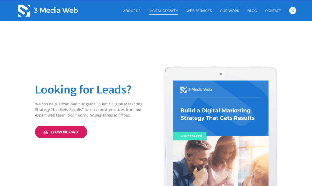
As you scroll through websites, you’ll see CTA’s on homepages and sidebars, near the navigation menus, pop-up screens, and beyond.
RELATED READING: How to Ensure Your Website Offers a Great UX
Good CTA Are Built With Good Design & Copywriting
Sounds exciting, right?
Just add a button to the bottom of your blog post telling readers to sign up for a free trial, and just like that, your conversion rates start skyrocketing.
As magical as that all sounds, it’s not quite that simple…
Penning the perfect call to action takes skill.
It’s easy to ask a user to act, but it sometimes takes a bit of finesse to get them to do it.
That’s where effective copywriting and smart design comes into play.
Don’t worry; it’s not as hard as it sounds. Just read the best practices I’m about to share below, and you’ll be well on building effective CTA’s.
Make Smart Design Choices To Make Your CTA Stand Out
Here’s the deal…
If people don’t see your CTA, guess what they’re not going to do?
Click on it.
A CTA should be obvious, if not impossible, to miss.
It’s worth experimenting with the design of your CTA to maximize its visibility.
For starters, pay attention to the following CTA design choices:
Make Sure Your CTA Doesn’t Require A Search Party To Find
If you put your CTA in the wrong place on your site, your readers might need a search party to find it. That, of course, is not optimal.
Call-to-action buttons need to be placed in a prominent position on the page. To attract visitors’ eyes, some CTA location placements are better than others.
The Case For Putting a CTA Above the Fold
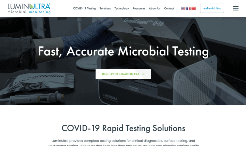
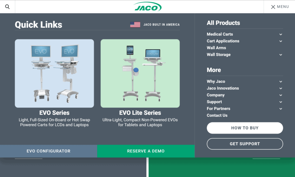
There are not too many places on a web page that are more prominent than the top, above the other elements. This is called above the fold.
Not only is it one of the first things a visitor will see, but a CTA at the top of the page, near or in the navigation menu, will also be a more memorable location.
RELATED READING: How 3MW Helped LuminUltra Redesign an Outdated Website & Rank Higher in SERPs
Why does that matter?
Let’s look at it from the user’s perspective and consider how people browse websites.
If the user were to open a page and see the CTA but browse the website more, it would be easier to find the CTA again when they are ready to click it.
In some situations, this makes more sense than in others. For example, if your CTA asks users to apply to a job opening, that user may wish to browse your site a bit more to see if they’d be a good fit for your company before immediately clicking the CTA.
The same can be said for CTA’s asking users to perform actions like “Sign Up,” “Schedule A Consultation,” or “Download The Software.”
RELATED READING: Superior Product Design Deserves Superior Web Design – 3 Media Web Gives Jaco Inc. A Website Overhaul
On the other hand, CTA’s asking users to download an eBook or whitepaper may be better suited as an inline CTA…
When To Use Inline CTA Placement
Putting your CTA somewhere in the body of your webpage, below the fold, you can prime visitors (so to speak) with content related to your CTA. Inline CTA can be in blog posts or dispersed throughout some of the primary pages of your site.
Commonly, CTA features big, bold, and in-your-face designs.
Inline CTA is a bit different. They are less distracting and obtrusive–although that’s not to say they are necessarily subtle either.
When you put your call to action in the middle of the page in an area with fewer distractions, it can work perfectly to grab readers’ attention. It is also likely to catch users’ eye who tend to “scan” the page.
So, when trying to find out the best place to put your call to action, consider what the CTA is about and whether or not it’s something a user is more likely to want to come back to or engage with immediately.
You can even try some A/B testing to find the most effective.
Color vs. Contrast For Button Design
Familiarizing yourself with color theory related to marketing and understanding contrast as it applies to web design is a great starting point that’s worth the effort if you want to build more effective calls-to-action.

That being said, there’s some debate over which color converts best.
Is it red? Blue? Green? Orange?
Now, before we go down the which-CTA-button-color-is-the-best-rabbit-hole, let’s consider CXL Institute’s take on it:
“No single color is better than another. Ultimately, what matters is how much a button color contrasts with the area around it.”
You see, while there is no shortage of tests being done on conversion rates for specific colors, the bigger picture of all those tests reveals the biggest difference isn’t the color itself but how much the CTA button stands out from the rest of the page.
For example, if the primary color of your website is green and you decide to make your CTA’s green, they will blend into the page design instead of popping off the page and grabbing the reader’s attention.
From this, we can conclude that the best color to use for your CTA button is one that contrasts with the other elements of the webpage, making it impossible for the reader to miss.
Make your CTA bigger (or smaller)
Make sure your CTA button is obvious on the page. A larger button will make it easy for your CTA to be seen.
A properly sized CTA should be large enough to be easily spotted but not so large that it throws off the page’s design or triggers a banner blindness response from the user.
Since most web traffic now occurs on mobile, it’s ever-important to optimize for mobile readiness.
For mobile optimization, the Web Content Accessibility Guidelines (WCAG 2.0) suggest using a minimum of 44 x 44 pixels for touchpoints (in this case, the touchpoint is the CTA button). It is a piece success criterion to achieve a WCAG “AAA” level of conformance—the highest rating available.
RELATED READING: How to Ensure Your Website Offers a Great UX
But Most of All, Make Your CTA Button Obvious
Another common issue is over-designing a CTA button. It may be tempting to have unique, creative icons made for your CTA, but it still needs to be obvious that the button is clickable!
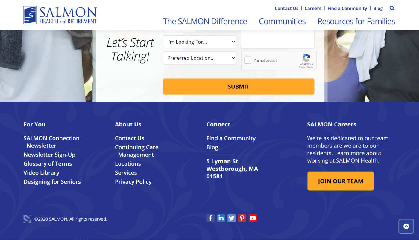
Don’t accidentally disguise your CTA button with unusual designs!
RELATED READING: 4 Visual Elements Your Website UX Needs To Get Right
How To Write CTAs That Convert
Outside of the design and placement of a CTA, it’s equally important to consider the copy of a call to action fully.
The design, of course, is what catches the eye and draws the user into the CTA. The copy is what encourages them to complete whatever it is the CTA is asking them to do.
So, let’s look at some best practices for writing CTA.
Keep Your CTA Succinct & Choose Your Words Wisely
Remember, you’re writing a CTA, not an epic novel. Try to keep it to three or four words max.
The copy for a CTA button needs to be short and to the point. If the CTA is too wordy, they begin to lose its effectiveness.
Conversely, CTA button text that is too short also loses some of its oomph. Combine it with a few other words to make it catchy and interesting.
In other words, don’t just use the word “Submit” or “Go” for the sake of brevity. Instead, try filling it out a bit more.
Use phrases like:
- Download My Free Guide
- Schedule A Consultation Now
- Reserve A Space
- Find Out How

First Person vs. Second Person
Notice how we’ve used the first person in the above examples using words like “My” instead of “Your”?
There’s an excellent reason you should do the same when writing your CTA, and the proof is in the testing…
Michael Aagaard from Unbounce ran some A/B tests comparing calls to action written in the first person versus calls to action written in the second person.
His testing resulted in an important discovery:
It turned out that using the first-person language resulted in an astonishing 90% increase in CTA clicks.
Convey A Sense of Urgency
Fear of missing out, or FOMO if you will, is a real thing.
Creating a sense of urgency in the messaging encourages people to engage with your CTA when writing your CTA.
You’ve probably seen a CTA with a countdown timer letting users know exactly how long they have before a deal or offer expires. This tactic shows people’s concern that they may miss out on something if they don’t act now.

However, a countdown timer isn’t the only way to convey urgency.
Time-sensitive phrasing such as “Order Now Before It’s Gone” or “Only two spots left–Reserve Now!” can garner the same response.
Give Users A Good Reason To Click Your CTA
“What’s in it for me?”
That’s what’s going through most people’s minds when they come across a CTA.
If the reward for following the CTA isn’t useful, they won’t engage with it.
In addition to providing them with something useful, make sure the value proposition of your CTA is very clearly stated upfront.
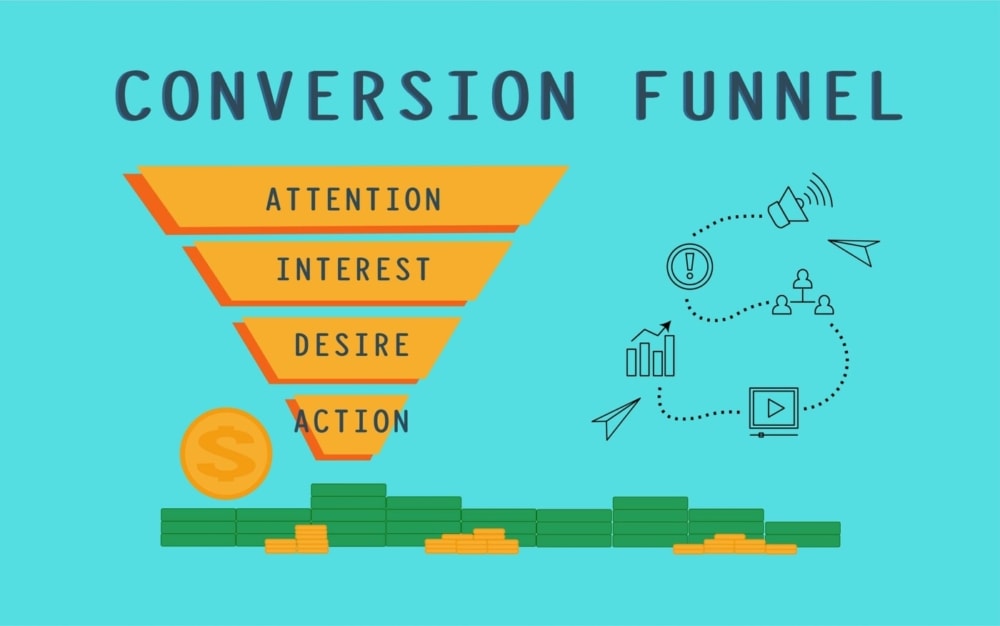
Use words that create enthusiasm and excite the user about what they will get in return for following the call to action.
Don’t just talk about your business. Explain to people precisely how your business is going to help them.
Rather than saying something like:
“Learn how to grow your email list.”
Try getting more specific using phrasing such as:
“Sign up now to grow your email list by 10,000 subscribers in 10 days.”
Turn High-Quality Traffic into High-Quality Leads
Focus your digital marketing efforts on not only generating traffic to your website but turning that traffic into qualified, high-quality leads. Engage your site visitors with content or by building functionality into your site that sparks more conversations.
You can use the data from your converting visitors to further build your knowledge base of customers and drive real value for your business.
Bonus: 10 Conversion Rate-Boosting Tips
1. Create a Custom Experience for Each Consumer
The rise of social media as a key component of a company’s SEO strategy, along with other trends such as the surge in mobile use, has created a shift from product-centered marketing to a more customer-focused model. Creating a custom experience for each consumer and engaging with them one-on-one in real-time through social media and other tools encourage conversions across demographic groups.
2. Use FOMO to Boost Sales
Nearly everyone has been haunted at some point by FOMO, or Fear Of Missing Out – that nagging feeling that something good is passing you by. Exploiting that fear with time-sensitive promotions or one-time-only sales opportunities creates a sense of value that encourages people to buy.
3. Tap the Power of Video
Sites and landing pages that incorporate video can see a dramatic jump in conversion rates – and videos of just about all kinds can help to put a human face on a company and establish a closer relationship with existing and prospective customers. Video content can include tutorials, reviews, and a wide range of demonstrations.
4. Create a Mobile-Friendly Experience
Today, almost half of all internet users will access the relevant sites through mobile devices, so making the site, landing pages, and shopping cart pages mobile-friendly can boost conversions. Pages that fail to display or links that don’t work on mobile devices can cost sales and drive customers away.
5. Stay Accessible with Chat Bots
Customers expect to be able to connect with a company at any time, so automating functions such as frequently asked questions and general sales pages with interactive “chatbots “can help to keep customers engaged with the site and boost conversion rates.
6. Add Eye-Catching Calls to Action
Prominent, visually appealing call-to-action (CTA) buttons can make it easier for customers to click and buy. Use the principles of color psychology to find the best colors for your site and consider animations and styling such as rounded corners and drop shadows to keep your CTAs front and center.
7. Engage Customers with Interactivity
Today’s consumers want to engage with their favorite brands beyond simply making purchases. Surveys, questions, contests, and activities like posting ways they use a product can keep them involved with the company and willing to buy.
8. Apply Visual Psychology
Visual psychology – the principles of design that create a visually appealing website or landing page – can help with conversions, too. Inviting, well-designed pages that offer a pleasant user experience encourage visitors to stay on the site.
9. Know Your Visitor’s “Gotta Have It” Point
In today’s crowded marketplace, targeting customers’ needs is key to improving conversion rates. Knowing exactly what visitors are looking for – the moment of deciding they must have the product – helps to create an environment that triggers a sale.
10. Use Plenty of Landing Pages
An effective company website needs the usual “about” and “home” pages. Still, landing pages for individual products and promotions can boost sales by making it easy for visitors to purchase immediately.
