 Deciding on a edgy website design is hard. Do you want it to be flashy or subtle? Buttoned-down or artsy? Classic or avant-garde? How about edgy designs?
We vote for edgy website design. Here’s why.
Table of Contents
No matter what, an eye-catching website or edgy website design that keeps visitors coming back is essential to the online success of any business.
Why?
Because choosing a website design that stands out from the crowd is a key part of building a brand.
Giving your website a makeover with today’s edgy new design trends can help your brand gain new visibility – and a new attitude.
Looking to build an edgy website for your own business? We’re here to help. Reach out to get started.
What is Edgy Website Design?
“Edgy” used to mean feeling on edge or anxious.
But in the world of UX design, edgy takes on many new meanings, and any or all of them might be appropriate for the look and feel of your website.
Edgy might mean innovative and creative, cutting edge or avant-garde, outside the mainstream with a spice of danger thrown.
Like D.FY, a digital agency whose website captivates you with movement the second you click on it:
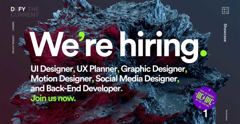
Edgy can be expressed in many ways, too – from cool minimalism to the rough edges of urban grit. Fonts, colors, and images all play a role in creating an edgy feel in website design.
The combinations are virtually endless.
This is good, since these days, everyone wants an edgy design.
You and your ten closest friends can all have edgy websites, but they may all look completely different.
Whatever form you choose, here are three reasons to consider making your website edgy – or edgier.
1. Boost your site’s visibility
So, how do you become the diamond in the rough when the rough is made of diamonds?
Put your own spin on it. We’re drawn to the shiny thing that looks different than all the rest.
Edgy site design changes favor strong, textured backgrounds paired with minimal fonts or beautiful ornate fonts on simple backgrounds.
Example: Tondo Design

The color-changing on Tondo Design’s website could not be more striking, yet still professional.
Colors can range from dramatic black and white to high contrast, pop art style palettes for a highly visible and memorable look that separates the site from more traditional professional sites.
But most importantly: It needs to suit you.
Edgy site designs can cover a range of styles, so finding one that complements a company’s brand and expresses its unique “personality” is essential.
For example:
A rough graffiti-inspired homepage might not be the best advertisement for a bakery specializing in wedding cakes while a graceful looping script might be perfect
Here’s another example:
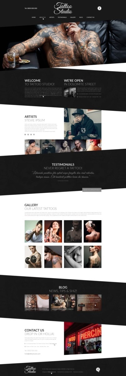
Example tattoo parlor website template, by Robby Designs.
You’re creating a website for your tattoo parlor. You want to come across as chic and professional while still catering to the right audience.
Go full professional, with boxed information and draw inspiration from successful tech or consulting sites.
Pick a simple color scheme and an easy-to-read font but add in some artistry.
Here it is…
The black and white design with the plain all caps font gives the design the sleek look you were searching for while the swirling title and use of diagonals communicates the artistry of the business.
It’s the best of both worlds.
You just need to find the balance that suits you and your audience.
You try.
You’re putting up a website for your old fashioned record store.
Cutesy font with swirls on a pink background.
All-caps vintage font with a red and black color scheme.
Both might look fantastic. But only one will give your site the visibility that you want.
2. Keep up with web design trends
Just like clothing trends, trends in website design evolve rapidly.
Styles that were cutting edge a couple of years ago can look stagnant and outdated compared to newer, more dynamic designs.
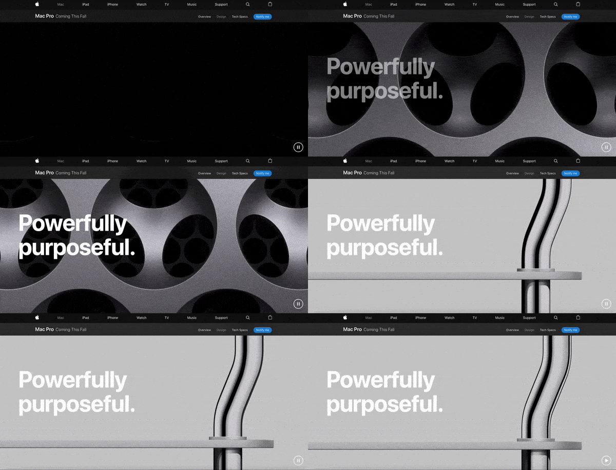
Example: Apple Mac Pro
The Mac Pro section of Apple’s website is another great example.
Why does it matter?
Because it takes 50 milliseconds for a viewer to make up their mind about a website. You want them to decide in your favor.
38% of viewers will leave a website if they find it unattractive.
That is 38% of your potential customers.
If you have an outdated style, that could be the only excuse a viewer needs to look elsewhere.
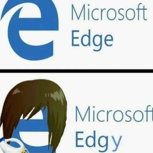 What can you do about this?
Well, edgy is in.
Edgy design trends give websites a polished, sophisticated look that can take any form, whether your a cupcake company or a skateboard manufacturer.
Most importantly, edgy website designs look new, and that newness could be enough to keep that 38% of viewers around.
You may have a perfectly functional, traditional, predictable style for your site, but if it isn’t eye-catching, fun, or engaging, say goodbye to over a third of your potential viewers.
Check out this one.
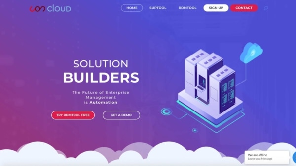
Example: Uon Cloud
Uon Cloud is a tech company that designs automatic tools for enterprise management.
When you think of words like tech and management, you may think your typical, boring, cookie cutter website.
But Uon cloud goes against that stereotype to create and eye-catching edgy design that fits their brand and their viewership.
3. Mobile first.
If you’ve never heard someone say that phones are the newest and most widespread addiction, then you’ve probably been living under a rock for the past twenty years and need to take a fresh gulp of reality.
We’re all addicted to the point that mobile traffic now accounts for half of ecommerce.
Not only that, but 83% of adults think that a website should look as good or better on a mobile device than on a computer.
Example: WeAintPlastic.com
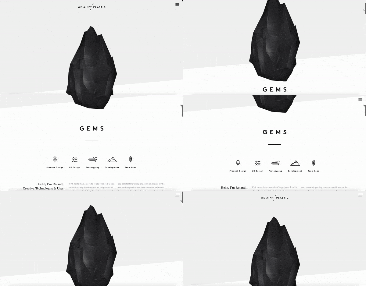

Edgy styles appeal to “digital natives” – users who grew up in the constantly changing online world, where millions of new things constantly compete for relevance.
So, today’s edgy, vibrant site designs are made with mobile in mind, which means that they maintain the same format across devices.
That helps capture visitors’ attention and keep them engaged in ways that older, more static site designs might not.
In a world where people’s tastes change every two days, an edgy design may be just what you need to refresh your brand and bring in business.
4. Accessibility
Web designers are thinking about accessibility more and more, making sure their designs work for everyone using the internet. This is a good thing. A more equitable web is better for everyone.
Make sure to follow the web design standards based on trusted organizations pushing for more accessibility online, such as the World Wide Web Consortium (W3C) and the International Organization for Standardization (ISO). These organizations outline and promote the standards by which web designers are making the web better for everyone.
Aside from following web design standards for their own sake, businesses following accessibility guidelines are also protecting themselves from potential liability. Lawsuits over inaccessible websites are becoming more and more common.
Plus, reaching more people with your website and content means you’re expanding your potential target audience. More people consuming your content means more chances at converting site visitors into leads for your business.
5. Digital Experience Optimization
The future of web design is tied to digital experience optimization. As updates from search engines like Google drive up the importance of user experience to the success of a marketing campaign, the worlds of design and marketing need to work together more than ever.
Combining web design and marketing into one strategy, digital experience optimization offers a better chance at improving a business’s bottom line. That way teams can work together to optimize a website for conversions, for example, shifting the web design to drive traffic to high converting content or other valuable behavior paths.

