On a website, a competent user interface design, commonly referred to as UI design, makes it uncomplicated for clients to find what they need. It’s part of the polish that helps make a website attractive, prompting those visitors to return.
The UI design is largely what a visitor bases their first impression of a website on. 94-percent of a first impression is design-related, but we’ll get into the specifics later.
Needless to say, having a high-functioning and aesthetically pleasing user interface can make or break a company’s online presence.
Why Is UI Design So Important?
Without a good UI design, their experience may suffer. There’s a 40-percent chance that a user will abandon a site if they think it looks messy and lacks flow. That’s nearly half of a website’s visitors leaving it before they even get the opportunity to explore it.
So, what does it take to get visitors to stick around a website?
As bwired points out, a website is all about communication with clients—something that should be facilitated through simplification:
“Usability is the foundation of a successful user interface and is the easiest process for creating a positive user experience. Positive user experience is a critical part of the overall customer experience and helps define the relationship your customers have with your brand.”
Once a website has a solid UI design that keeps visitors on the site, the potential to boost conversion rates becomes a more likely reality. In fact, according to a Forrester Research study, good UI design won’t just boost conversions it can skyrocket them…The study reports that a nicely designed UX may increase your website’s conversion rate by 200 to 400 percent.
With statistics like that, it becomes clear why good UI design is crucial to a well-performing website.
User Experience vs. User Interface: What’s The Difference?
When you’re talking about web design, it’s important to remember the terms “user experience” and “user interface” aren’t interchangeable. But you’re not alone if you don’t understand the difference.
The user interface is what you see on a website, and the user experience is what you don’t. An attractive WordPress website might be described as having a good interface. Still, if it loads slowly or isn’t accessible to users on various devices, it’s providing a bad user experience. Building a strong, effective user interface is the starting point for creating an excellent user experience.
To ensure your website offers a good user experience, look at the interface elements early on in the process, so you don’t have to make a lot of changes once the site is live. For example, for a popular product-based website, we don’t want to lead with information “about the company” or testimonials — we want quick, easy access to the products or maybe a searchable interface right at the top. But for a product that’s not as widely recognized, testimonials become important.
8 Tips For Creating a Good User Experience
There is much to consider in the web design process if you want to create an attractive user interface and a good user experience. When you’re building a new website, you should consult with your designer and keep these tips in mind.
- Avoid the desktop-first approach. With the wide variety of mobile devices in use today, it’s important to think about responsive design from the start. A mobile-first approach means that you start with a product that runs the same on every device. Then, you can add extra assets that work on a desktop — instead of starting with a desktop approach and hiding assets on the mobile version.
- Build-in features that keep users informed about what’s happening. For example, if you have a page searching the database while the user looks at a blank screen, the user will have a bad experience. Instead, provide a graphic that shows how much wait time is left.
- Use slideshows sparingly. It’s easy to forget that responsive websites display slideshows on screens of all sizes. While slideshows can be immensely helpful on a desktop by making a big impression and promoting important services, they don’t look great on a smaller screen. When users come to a slideshow on a smaller screen, they generally skip it, which takes away from the user experience and also degrades website performance.
- Speed up your website using minifying code, optimizing images, and caching. Make sure your website loads quickly. Compressing HTML, CSS, JavaScript, and images can drastically speed up the time it takes for a user to load a page. Plus, Google search results place high importance on fast-loading and optimized websites.
- Ensure links are properly spaced on all screens. On a desktop or laptop, users are often using a mouse which makes it easier to click on links that are close to each other. But on small devices, it becomes a struggle. Make sure all clickable links are properly spaced for mobile devices.
- Let people make purchases without having to register. On e-commerce sites, allowing people to buy without creating an account or officially registering can make for a more streamlined user experience and lead to higher sales.
- Ensure your forms work correctly on all devices. I have faced so many problems trying to complete simple registration forms on a tablet or a smartphone. Those problems frustrate users and may cause them to give up, so each submits error could lead to a lost customer.
- Create features that work on screens of all sizes. Some features don’t work well on small screens, and a quick fix is to hide those features when the website is viewed from a small screen. That’s a serious mistake. A lot of people use multiple devices to access the content. Denying them a feature on one of the devices can lead to a bad user experience.
How To Create A Winning UI Design
With that in mind, how do you create a killer UI that will provide the greatest level of ease?
In most cases, the short answer will be finding a web design company to work with. Especially if you aren’t particularly savvy at creating such interfaces yourself.
But even then, you’ll want to stay abreast of what goes into devising successful UI designs. After all, it never hurts to be armed with knowledge. Knowing the right elements to include will be beneficial when explaining to your colleagues the importance of investing in a proper website layout.
To set you up for success, let’s explore some elements that go into crafting a beautiful website.

FURTHER READING: Easy Ways to Convince Your Boss You Need a Web Redesign
How Individual Elements Play Into Perfect UI Design
Simplicity is the hallmark of great interfaces. To be effective, the UI for a website should be eye-catching and easy to navigate.
Sounds easy enough, right?
Unfortunately, what seems to be easy to those outside the design world, actually involves a multitude of smaller elements that must come together to make this possible.
Great UI Is Intuitive
The user interface of a website needs to be easy for visitors to comprehend. One way designers achieve this is by using the concept of visual hierarchy.
What is Visual Hierarchy?
“Visual hierarchy is the order in which a user processes the information on a page; its function in user interface (UI) design is to allow users to understand the information easily.”
—Interactive Design Foundation
That concept of visual hierarchy extends to all information on the page, directing the visitor’s eye to the most critical content first. Take, for example, navigation elements that provide how visitors move around a site.
They might come in the form of individual menus, buttons, or links, but on the whole, they should be organized in a way that is easy to understand. There should be an order or ranking to these so that visitors can understand which options are of the greatest importance and which are less so.
Good User Interface Design Doesn’t Stop At The Navigation Bar

The visual hierarchy technique covers all of the information presented on your site to help make it understandable. That’s right, visual hierarchy extends beyond navigation elements. Here are just a few more ways it lends a hand to UI design:
- Size matters: Larger elements are what first grab the viewer’s attention. If there is a very important element on the page, one way to ensure visitors see it is by making it larger.
- Eye-catching colors: Another way to direct readers’ attention is by using bright colors; they are much more likely to be eye-catching than more subtle or subdued colors
- High contrast: Using high-contrasting colors is a known way to catch a visitor’s eye.
- Experiment with alignment: The eye tends to follow a natural path (left to right in western countries). Placing elements outside of the typical alignment attracts attention, but this needs to be done thoughtfully.
- Consistent styles: Make sure related content is displayed using the same style to help readers understand the content is connected.
Beyond that, things such as proximity, whitespace, textures, and styles all play a role in catching visitors’ eyes and guiding them where they need to go.
As such, adjusting the UI’s typography and other elements are all ways in which designers can create the hierarchy they desire. For example, by diminishing the size of the type, they can denote certain bits of information as subordinate to those of greater size.
FURTHER READING: The Visual Elements of Web Design Can Make or Break Your Company’s Website
Great UI Is Clean
When visitors come to your site, they should be able to immediately discern what’s going on. If a website’s UI design is muddled, it will have difficulty achieving this.
Arguably one of the most important tools in a web design agency’s kit is the use of white space. Sometimes referred to as negative space, white space is the space surrounding the various elements on the page.
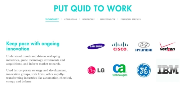
Like color, white space creates relationships between different page elements. Most notably, designers use it to create clearly defined blocks of information.
Smashing Magazine has a good take on using white space: Consider a situation in which an abundance of content on a web page is huddled close together. It would be difficult to decipher — an information overload that might prompt visitors to simply give up.
We know it’s tempting to fill up all the real estate on your website with content and design elements, but don’t overdo it!
By using white space to balance this information in smaller chunks, designers can create a more palatable UI design, making your content more effective.
Great UI Design Is Straightforward
Visitors to your site must get where they want to go — the first time.
If the information on your web page is unclear, they become frustrated trying to navigate and click away. The desirable alternative is using straightforward, descriptive information to know what they are clicking on.
The same goes for all of your website’s content.
- Make page titles refer to the information contained therein.
- Headlines for blog posts should follow the same formula.
- Keep symbolism to a minimum, and use appropriate graphics to maximize comprehension.
- Ensure that everything on your website is unambiguous to reduce confusion.
This not only improves the user experience and keeps them on your website longer, but it also works to improve your Google search rankings.
With Google’s “Entity Match” and the Hummingbird update, the popular search engine can now understand a page’s content beyond just the keyword it ranks for. That means the content needs to be highly relatable to the target keyword.
Great UI Design Is Consistent
Imagine if some of the elements above — typography, color, etc. — varied wildly from page to page on your site…
This scenario would shock visitors, creating tension as they tried to navigate. Great UI avoids this by keeping things consistent from page to page. Your website will have a sense of cohesion, and visitors won’t get the impression they’ve jumped to a different site by simply clicking on a link.
The World Wide Web Consortium (W3C) has been working to develop a set of web design standards to help take the guesswork out of consistent web design. With 94 percent of a visitor’s first impression of a website being design-related, one can understand why having a nice UI design is so important.
The standards being established by the W3C are comprehensive, covering a wide array of website elements. These include but aren’t limited to:
- Fonts and font colors
- Color theory across the website as a whole
- How to style clickable buttons
- Where the navigation menu should appear
- Location of the ever-important “Contact Us” button
- And where the sites search feature should be located
All of these design standards have been thoughtfully considered to ensure they are what works and appeals to visitors the most—effectively creating a solid UI design.
Adopt Existing Standards Or Create Your Own
Many businesses and organizations, as well as web design agencies, have adopted these standards and incorporated at least some of them into their web design protocol. Some have even developed their own set of specific web design standards.
One example is the United States Federal Government. Every federal government-owned website uses its set of web standards. By creating these universal UI design standards, they are ensuring all of their websites are intuitive and cohesive to visitors. Additionally, it ensures certain web requirements such as Americans with Disabilities Act (ADA) compliance are met.
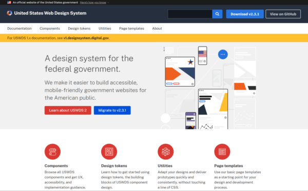
Of course, the US Federal Government is a very large operation, and it made sense for them to invest resources into developing their standards. Most companies won’t need to develop their own comprehensive set of standards.
That’s another reason why working with a good design agency pays off: they’ll already have a solid grasp of the best UI design standards and will easily be able to adapt that knowledge universally.
FURTHER READING: Web Design Standards: Guidelines for Consistency
Great UI Is Mobile Ready

One last thing that’s essential to know about great UI design… A website’s design needs to look and function properly on both desktop and mobile browsers. Two out of every three minutes spent online happen and 60 percent of all web searches are from mobile devices.
One way to accomplish a great UI design that transfers from desktop to mobile is by using responsive design. In a nutshell, responsive design involves building a website that renders correctly on any size screen. It does this using HTML and CSS.
FURTHER READING: Why Do I Need a Website with Responsive Design?
A Good Web Design Agency Can Bring It Together
Incorporating all of these UI elements skillfully is a difficult but necessary task. But the benefits of visitors having an enjoyable and easy time on your website make it all worth it.
To enhance the communication between your company and your clients, those clients should be able to understand how your website works, navigate clearly, and stay engaged as they explore your content.
A web design agency can craft a perfect UI design that brings the necessary considerations into the fold. They will ensure the client’s needs and wants are met while creating a seamless UI design that delights visitors.
This can take some preparation beforehand. Ryan Kohler, a UI/UX Designer here at 3 Media Web starts the process of UI design projects through a discovery process with each client.
During this one-on-one session, Kohler says, “We research and plan before beginning the actual design of the website. It is most important to create a thoughtful approach so that we can leverage the website to help the client grow the business through the website. That is our end goal.”
Ryan Kohler, 3 Media Web UI/UX Designer
If your website’s UI design needs a facelift or you need an entirely new site built for your company, consider reaching out to the team here at 3 Media Web. Our experts are standing by to help.

