Brand unity… Brand Cohesion… Regardless of what you call it, there’s one thing marketers and designers can all agree on, it’s that a solid brand unity strategy is important for businesses large and small.
What Is Brand Unity?
To fully grasp what brand unity is, let us first consider brand identity. StartupNation likens brand identity to a company’s personality and characteristics.
Now, brand unity involves ensuring your brand identity is cohesive across all its divisions, media, advertising, website, and so on.
For example…
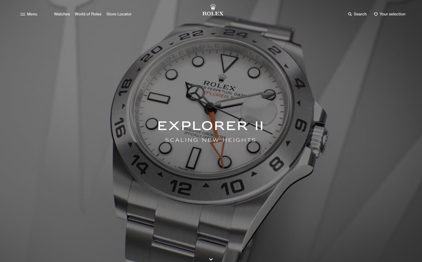
Imagine a luxury watch brand, like Rolex, that defines its personality through it’s modern, ultra-minimalist website.

As you can see, the Rolex web design is very clean, mostly monochromatic, with only pops of color accenting the page. If a person visits the site for the first time, with no prior knowledge of the brand, they could still conclude from the web design that they are high-end watchmakers.
Now let’s imagine the same visitor then clicked onto the World of Rolex page and was greeted by brightly colored graphics and fonts that look like they were written with a crayon.
That would cause a huge disconnect between how you perceive the brand after visiting their homepage versus the World of Rolex page.
The two design styles are just so opposite from one another, it would confuse customers and degrade any brand recognition the brand may have had.
“A brand identity encompasses every impression a company conveys. This brand identity includes advertising, promotional literature, logos, and any other means that carry the brand’s message to consumers.”
—StartupNation
As you might guess… brand unity is especially important in the web design process.
Need help with the brand unity within your own business website design? Our team of web design experts are here to help. Reach out today to get started.
Brand Unity In Web Design
As web designers, we need to pay close attention to brand unity across our work. There are even sets of web design standards that are often referred to in order to ensure a seamless look and feel across entire websites.
FURTHER READING: Web Design Standards: Guidelines for Consistency
When considering the design of a website, it’s our job to create a consistent look across the entirety of your site. Every design element we use, whether it be a logo, font, color palette, graphic, or otherwise works to form a solid relationship with one another.
That’s right, brand unity in web design is more than just slapping a logo on top of each page. It’s actually a well thought out process that has many facets and benefits from a certain level of web design expertise.
Quick Check: Does Your Website Display Good Brand Unity?
Go ahead and open your website in another tab. I’m going to list a handful of things to look for to help determine if your website would benefit from some updates to its design.
- Brand identification. Is the name of your company and/or your logo displayed in a similar way on all of the pages of your site? Can it be found in the same place, the same color, and the same size on all the pages of your website?
- Navigation. The navigation should function the same regardless of where you are on the site. In most cases, it should look exactly the same to provide a consistent user experience. Of course, there are always exceptions. For instance, USA Today provides different colors for their primary topics, so the navigation accent color changes based on which topic you are on, but that was an intentional decision that is part of their brand. All in all, unless you have a very specific reason for adding distinction to a navigation bar on certain pages, you should keep it the same and consistent with your brand.
- Graphics and other visual elements. These must also be consistent across your site. That means your site has one color scheme and sticks to it. It features one or two fonts—including their color and size—that are used throughout the entire site. And, similarly, sticks with the same icon style on all the pages.
- Tone, voice, and narrative of your website’s copy. Does all the copy sound like it was written by the same person or piecemealed together by multiple people, all with different writing styles? Also, does the copy project your brand’s identity? Do your page titles sound connected?
- The usability of your website. This one often goes unchecked when it comes to brand unity. To ensure the user experience is smooth and flowing as much as possible, make sure all the buttons, links, and interactive elements are the same. Are links blue on one page and orange on another?
Although the above issues are some of the most common, they are far from being the only ones. The good news is, while brand unity may seem overwhelming, it’s not an impossible hurdle.
Thinking About Brand Unity Like A Web Designer

So, the examples in our checklist cover some fundamental aspects of brand unity that can be identified by anyone with the thought to check for them. Now, we’re going to take a deeper dive and start breaking things down into more specific elements—closer to a web designer’s thought process.
Color
When it comes to website design, color is one of the most important elements to brand unity. Ever notice how all your favorite websites stick to one color scheme?
That’s because colors are inherently strong visual links. People use them to form connections, which is exactly what brand unity is all about.
Take a look at our webpage, for example. Click these pages to open them in another tab:
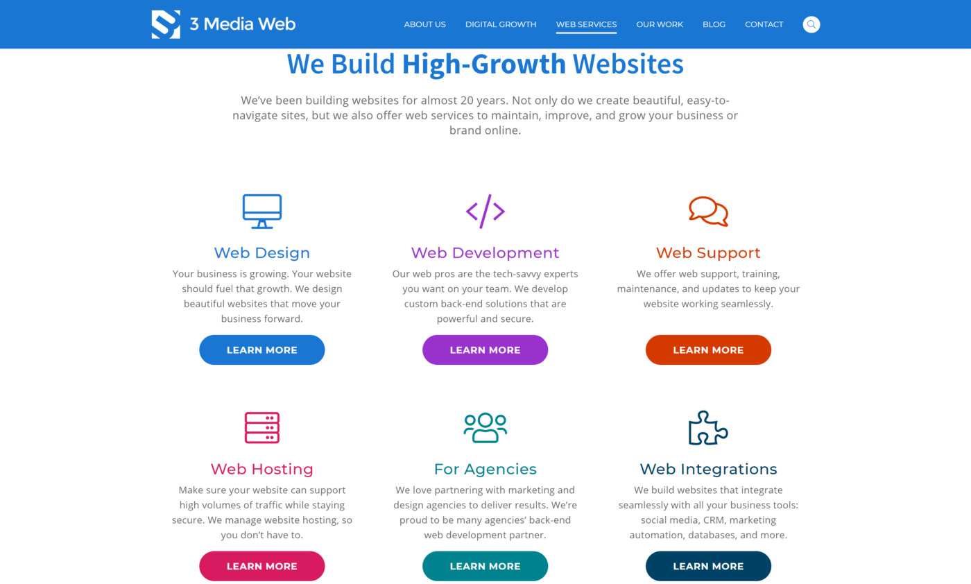
As you browse through the 3 Media Web pages above, you’ll notice the colors stay very consistent. The background colors are the same, the font colors are the same, the logo color stays the same…
Okay, while you have those tabs open, let’s move on to some other brand unity touchpoints. You can refer to those pages as we work through them.
FURTHER READING: Crafting the Perfect UI Design for Your Website · 3 Media Web
Alignment & Proximity
Alignment is another aspect that plays a role in a website’s visual unity. Bad visual alignment of a webpage’s content is quite obvious when it’s bad.
However, so long as the alignment is good, it easily goes unnoticed by the average web viewer’s eye quite often.
Let’s take a look at a good example of alignment in action:
Jump back to the 3 Media Web Web Services page again to look at an example. Scroll down and you’ll quickly see where alignment comes into play.

Specifically, notice the grid pattern used to show some of our web services offerings. The grids make presenting a lot of information in a small space still look aesthetically pleasing.
This type of alignment is used all across our website as well as websites we design and develop for our clients. It works in conjunction with proximity, another useful theory, that when applied correctly, helps visitors make connections with all the elements on the page.
Proximity is just what the name says it is:
If web elements are close to one another, they’ll appear to be together. Thus, creating a sense of balance and unity. In our example above, notice how all the items in our web services grid—Web Design, Web Development, etc…— all look connected and part of the same story?
It’s just like how our mind automatically makes the connection that, when we see two people walking down the sidewalk talking and laughing, we recognize them as having some kind of relationship.
The same goes with elements and content on your website. The goal is to make the connection of “togetherness” for the viewer, rather than them having to piece everything together on their own.
FURTHER READING: Small Web Design Changes Can Make a Big Difference
Repetition
Next, let’s consider repetition and how it works to strengthen unity in web design as well as branding. In short, the more visual elements of your site and brand are repeated, the more easily they will be recognized.
Think about the Apple logo, for example. It doesn’t need to have Apple’s name spelled out for people to make the connection that they are looking at an Apple product.
Because Apple uses the logo over and over again without changing how it looks, a person can look at it and immediately come to the conclusion, “Hey, this is something I’ve seen before—it’s the Apple logo!”
The same goes when you’re designing a website.
We actually touch on this in a previous article on web design standards. In that article, we talked about the now-iconic Hamburger Icon and how it’s widely recognized as a clickable option to see a menu.
Interestingly, even though it started primarily as a menu icon on mobile websites, it’s now popular enough that brands are starting to use them on the desktop versions of their sites as well.

The hamburger icon earned that recognition because of how repetitively it is used by web designers across all kinds of websites and apps. That is the magic of web design standards at work!
Now, imagine browsing a website that uses the hamburger icon to view the navigation menu on one page, but a more traditional navigation menu on another page. The webpage would feel disjointed from a viewer’s perspective since they would instinctively look for the same style menu as they saw on the previous page.
As previously stated, there are always exceptions to the rule and cases where certain pages may deviate from the main navigation slightly to narrow its focus on a particular topic, but those cases are few and far between.
Consistency
Consistency is key, and it’s the last thing we’ll cover in the quest to understand the roles played by brand unity and cohesion in web design.
A good way to understand how consistency works in terms of brand unity and forming cohesive connections is to think about a basketball game. Can you imagine how confusing things could get if you tuned in to a fast-paced ball game and all of the players were wearing different colored jerseys?
That would make it really difficult to figure out who is on which team. Matching jerseys make it easier for spectators to see the teams for what they are—a team.
So, what about websites? Of course, they don’t wear jerseys, but there are still many different elements that need to be consistent.
- Typography
- Font styles
- Link styling
- Color palettes
- Icon styles and placement
- Menu styles and placement
- Button styles
- And more!
“Consistent customer experience can be a key differentiator for a brand. It reinforces your identity, and in a marketplace full of competition and noise, it keeps your audience focused on the most important message of all – yours.”
–SDL

Brand Unity And Omnichannel Engagement
Now that you’ve got the gist of what brand unity looks like in web design, it’s important to know that all the effort that went into making the perfect, uniform website should be carried over into your other assets as well.
SDL conducted a survey of 18-36-year-olds and found that 60-percent of them fully expected the experience they have with a brand to be consistent regardless of whether the interaction is on their website, social media page, in a store, or elsewhere.
It’s safe to say the omnichannel user experience should be repetitive across all outlets.
Your social media pages are especially important. Although you won’t have full creative control over all the elements we’ve outlined above, when you’re designing your social pages and posts, you should do your best to incorporate these tactics as much as possible.
FURTHER READING: Making Your Company Page Stand Out on Facebook
This is easily accomplished by using the same logo in the same color as it appears on your website. Taking it a step further, you can use the same fonts and font styles in your custom social media graphics as you do on your website.
Many brands choose to compile a brand style guide just for this reason. As Liz Moorehead, from Impact, so accurately puts it:
“A style guide can include anything from how your logo should be used, which colors or fonts accompany it, to your business’ voice – how the writing style and overall presentation appeals to your audience and showcases who your company is.”
Liz Moorehead, Editorial Director at IMPACT
A brand style guide makes accomplishing consistency in branding much easier, especially when the workload is spread across a team of people.

