 Great biotech web design can present a unique challenge.
Biotech websites often struggle to distill complex concepts into simple web content.
What’s the fix? — Tell human stories.
Table of Contents
The audience for biotech websites is generally familiar with medical and healthcare issues.
Stories are a key ingredient to any successful biotech website. We know from experience working with our Biotech website clients.
We’ve also noticed some common threads in what biotech companies need in their website design and their relationship with their design partners.
If your firm or agency is working on a biotech startup website, or if you’re working in-house as a marketer at a biotech startup, what we’ve learned should help you along the way.
Looking for a new partner to help with your own biotech website? 3 Media Web is an award-winning web design agency ready to help you get started.
Awesome Biotech Web Design Examples
As a marketer or design partner for a biotech startup, you can often begin the discussion by identifying well-designed websites and building a consensus on useful elements.
We’ve identified eight biotech websites that are prime for harvesting ideas for your client’s or company’s own website to get you started.
Akouos
Remember when we talked about the importance of telling human stories?
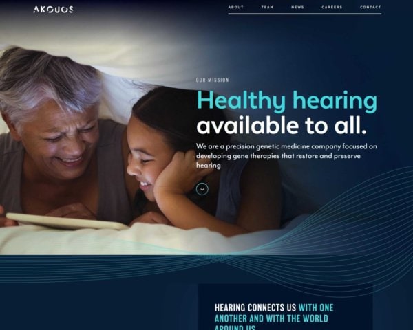
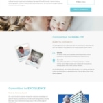
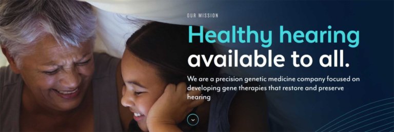
Well, Akouos, a provider of gene therapy for hearing loss, conveys a pretty compelling story with a clean, scrollable design on their homepage.
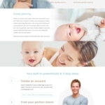
Upfront, they explain their mission of “healthy hearing available to all” with personal photos of folks with hearing loss (i.e., not corporate stock photos) that rotate with each visit.
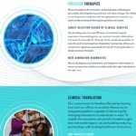
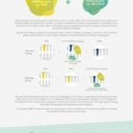
Scroll down, and they explain the widespread impact of hearing loss and how their gene therapy addresses the issue, with colorful graphics and photos accompanying that explanation.
Without requiring an extra click to a secondary page, website visitors receive a clear explanation of what the biotech company does and who they benefit from.
Akouos Biotech Web Design Homepage
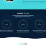
More Akouos Screenshots
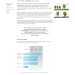
Akouos’ website tells us that they’re restoring and preserving high-acuity hearing in one of the greatest unmet challenges of medicine.
According to the startup, 360 million people worldwide have disabling hearing loss, but no FDA-approved therapies address it.
They are developing targeted AAV-based gene therapies for sensorineural hearing loss, which results from dysfunction or damage to the inner ear’s sensory cells and/or nerve fibers.
Sensorineural hearing loss is found in most cases of newborn deafness. It affects nearly a quarter of all adults over 65, making it the most common form of hearing loss and one of the most common of all sensory disorders.

Analytical Lab Group
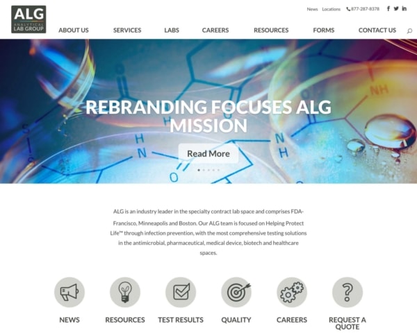
Analytical Lab Group (ALG) focuses on its mission, helping protect life™, through infection prevention with testing solutions in the antimicrobial, pharmaceutical, medical device, biotech, and healthcare arenas.
ALG is an industry leader in the specialty contract lab space with FDA- and EPA-focused laboratories across the United States and San Francisco, Minneapolis, and Boston facilities.
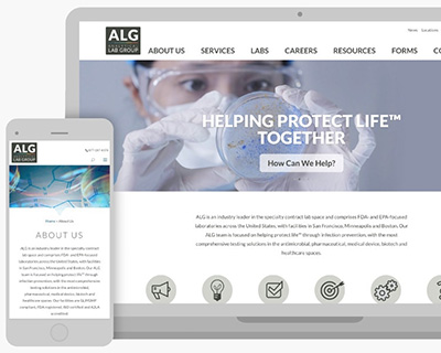 The client’s main issue was rebranding the company and their website to coincide with the acquisition of three companies into Analytical Lab Group.
This hard deadline gave the 3 Media Web team just one month to develop and launch the new website.
Content needed to be organized to determine where the information would be positioned into the existing layout and how the text for four companies would be arranged into parent/child relationships of content pieces.
One client concern was that the website is compliant with the European Union’s GDPR, which requires all websites to advise the user exactly what data the website maintains regarding cookies saved on the user’s computer.
Analytical Lab Group Homepage
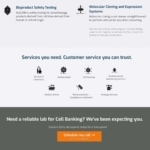
More ALG Website Screenshots
Working with the client’s web design firm in Florida and their content writer, the 3 Media team helped organize the content during the content entry phase of the project.
We selected a WordPress theme that was compatible with the design and could accommodate a robust page builder.
This enabled us to integrate specific elements, such as lead generation forms and a homepage slider, into the new website.
In addition, 3 Media Web ensured that the site is GDPR-friendly. The client’s legal team reviewed the privacy policy, and the ALG staff was properly trained.
Analytical Lab Group was very pleased with the result, and the announcement of the merger and the launch of their new website met their deadline and exceeded their expectations.
Beam Therapeutics
According to Statista, more than 52 percent of global website traffic came from mobile phones in 2018.
Not only that, but Google has made site mobile-friendliness a significant part of its search algorithm in recent years.
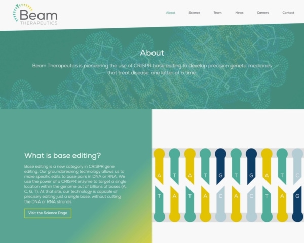
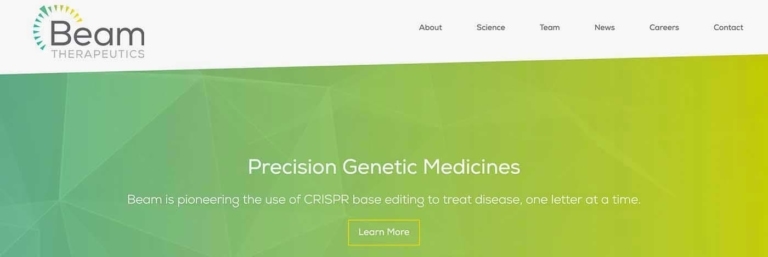
The web designers for Beam Therapeutics, a developer of precision genetic medicines, appear to get this.
That’s even true when it comes to subtle motion graphics to enhance the user experience.
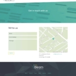
While it may lack some of the more intricate visual elements of other sites on this list, the responsive Beam Therapeutics site is equally suited for desktop and mobile.
Beam Therapeutics Preview
More Biotech Website Screenshots
The use of color gradients in the background doesn’t detract from the copy’s readability, which is written concisely not to appear cluttered on smaller, narrower screens. Subtle animations provide a tasteful and pleasant sense of motion as the user scrolls.
Like other sites on this list, users can get most of the company information they seek directly from the logically organized content on the homepage.
Celltreat
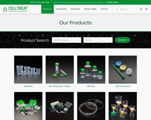
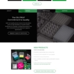
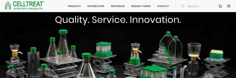
CELLTREAT Scientific Products is an online seller of high-quality laboratory plastic consumables for companies that require sterile and non-sterile products.
Their online store offers more than 425 different products in dozen-plus product categories. They sell direct through e-commerce and 33 specialty and national distributors.
In addition, the site had to speak to web visitors seeking information, comparing pricing, and just browsing. It was important that the website be accessible and engaging for both direct buyers and distributors.
The client is very marketing- and promotional-oriented and required that the new website be flexible to accommodate frequent promotional and sales information that will resonate with users without dominating the graphics or product information.
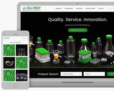
3 Media Web made excellent use of the client’s high-quality, professional product photography that carries the logo color throughout the website.
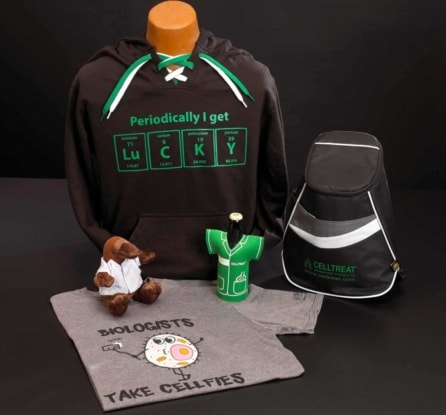
Just a short scroll down is the main SEARCH bar which allows the user to select a product category and/or specific product— including these funny “swag” items:
To accommodate the client’s desire to add a bit of creativity to the website, 3 Media Web created product illustrations used in an array with product category blocks that link to overview pages that the user can drill down to individual products with descriptions and pricing.
Celltreat Biotech Web Design Preview
More Biotech Website Screenshots
3 Media Web created two areas where CELLTREAT promotions can be featured and easily updated by the client.
At the top of the HOME page, a ticker scrolls left to right with new promotional information that the client can update or hide, as desired.
The CELLTREAT Scientific Products website has a simple user interface and a professional design with a personality that addresses the needs of all its web visitors and makes it simple for its buyers to make an online purchase.
LuminUltra
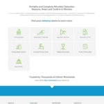
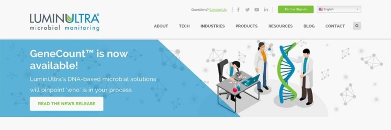
LuminUltra is a biotech company based in Fredericton, New Brunswick, Canada, that strives to teach the public about the risks of microorganisms in water systems.
They provide fast and simple solutions to mitigate these health risks in water.
The Canadian biotech startup’s previous website did not reflect their message of “if you do not measure it, you cannot control it.”
The site made it difficult to manage content and integrate inbound marketing solutions.
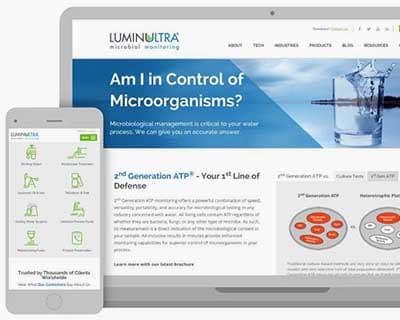
LuminUltra’s market has expanded to the USA and globally, and the company wanted a website that would reflect the look, feel, messaging, and interaction of a progressive international biotech company.
A new responsive website was created for LuminUltra to meet their vision and goals better.
LuminUltra Biotech Website Preview
More Biotech Web Design Screenshots
Current photos, graphics, and colors were used to reflect a more modern look and feel.
New interactive features were implemented, such as a custom industry solution finder and a custom login system.
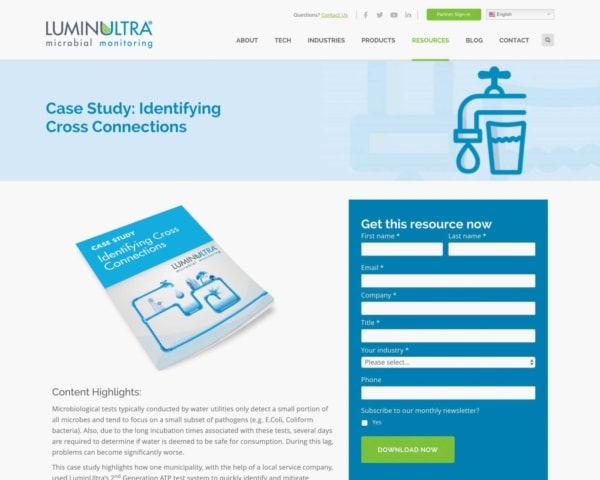
Pardot was integrated into the site and allowed the client to manage their gated content and inbound leads programs easily.
The client requested an accelerated timeline for this project, which was met with success by the 3 Media Web team.

MatTek Corporation
3 Media Web won the 2016 WMA WebAward for Best Biotechnology Website with MatTek Corporation, developing advanced technology to engineer tissue cells on computer chips for medical testing.
MatTek’s online presence was decentralized with a corporate site and another site for e-commerce.
Neither clearly communicated the power of MatTek’s technology or its leadership in the field.
3 Media Web integrated the corporate and e-commerce sites into one site, built from scratch on WordPress and WooCommerce to power e-commerce.
A large library of existing documents was consolidated and made accessible from a custom search tool for customers to find the information they need easily.
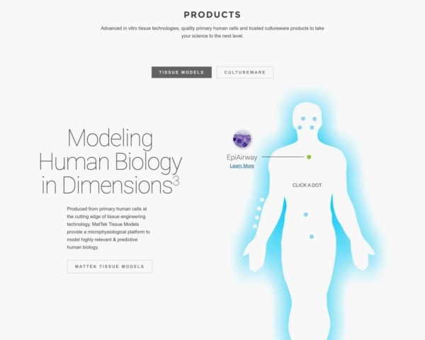
MatTek Website Products Page
More MatTek Biotech Website Screenshots
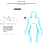
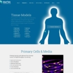
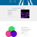
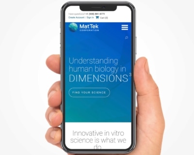
An interactive graphic on the homepage (pictured above) allows visitors to explore the range of 3D human tissue models offered by MatTek.
Users can then click or tap on each tissue model to be directed to a page with in-depth information.
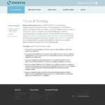
Minerva Neurosciences
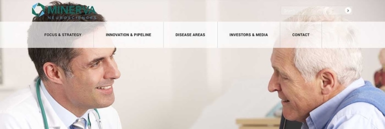
Minerva Neurosciences is a biopharmaceutical company that creates treatments for central nervous system diseases such as Schizophrenia, Insomnia, Mood Disorders, Major Depressive Disorder, and Parkinson’s.
Because current treatment options often limit neurological improvement, Minerva’s mission is to create newer and highly innovative treatments based on extensive research.
Their focus is to transform and improve the lives of those affected neurologically with breakthrough drug therapies.
Minerva Neurosciences’ website was not updated and didn’t reflect how they had matured as a BioPharma company.
The website design was outdated and included stock images that didn’t reflect Minerva’s growth in its field.
The client needed a responsive website that provided clear and concise information for investors, peer scientists, and regulators so they could clearly understand Minerva’s mission and vision.
3 Media Web worked with Minerva to create a website with a contemporary design and message consistent with the company’s image.
Minerva Neurosciences Website
 More Minerva Neurosciences Screenshots
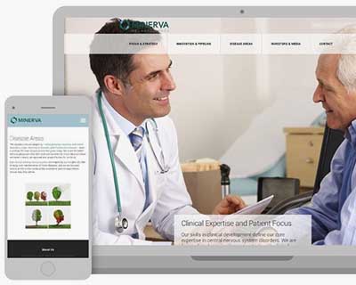
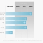
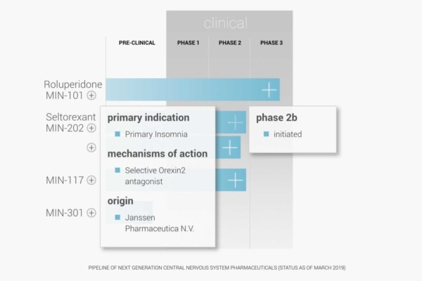
3 Media Web designed a mobile-friendly site that allows easy access to the current trial and clinical-stage updates on Minerva’s central nervous system disease therapies.
Their new site accurately portrays the new pharmaceutical treatment on the market today and includes easily editing information.
3 Media Web updated Minerva’s company logo and crafted a positive, welcoming message to invest or those seeking information about new pharmaceutical therapies.
With customized relatable graphics reflecting Minerva’s BioPharma niche, the website provides visitors with an informative and unique experience while continually developing central nervous system research.
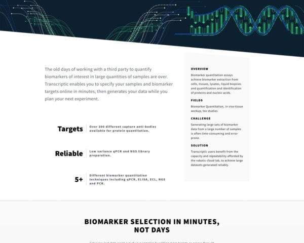
Transcriptic
It’s crucial to know your audiences when developing a biotech web design.
Sure, it’s important to speak in layman’s terms to garner goodwill from the public and support from potential investors. But Transcriptic also sells cloud-accessible assays directly to lab professionals.
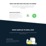
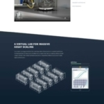
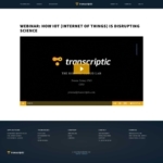
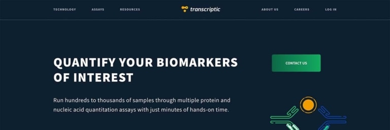
Their website clearly explains their different products on their homepage, linking to each page from blocks with appealing graphics and short descriptions.
Transcriptic Biotech Web Design
More Transcriptic Website Screenshots
For biotech startups with multiple offerings like Transcriptic, it would be beneficial to follow their lead and provide multiple navigation paths to each offering, both from the main navigation menu and the main content of the homepage.
Transcriptic has also avoided the common mistake of detailing all offerings on one page vs. giving each their own dedicated page. Without dedicated landing pages, the site would be unlikely to appear in top Google search results for inquiries related to each offering.
Xytex
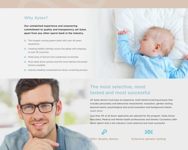
Xytex is a global provider of innovative cryo services, serving healthcare professionals, families, and individuals with unsurpassed quality, honesty, and compassion.
Since 1975, Xytex has provided the expertise needed to fulfill their patients’ dreams of starting or growing a family. Xytex offers storage of blood and other body tissue in addition to its donor sperm program.
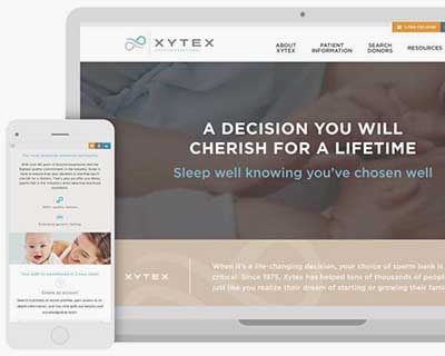
3MW helped Xytex launch a beautiful, functional new website.
Their corporate headquarters are located in Augusta, Georgia, and they have offices in Atlanta, Georgia, and New Brunswick, New Jersey.
Xytex came to 3 Media Web with an outdated website and a disjointed integration into their back-office system that managed all key areas of their business.
Their vision was to overhaul their website to include a large volume of complex information accessed effortlessly.
They wanted a CMS system that was integrated into the back office and would be easy to use.
We needed to combine several customized technical components into one that utilizes the latest technology and includes features that add value to the user experience.
An added challenge was to meet a specific timeline to coincide with the launch of other marketing efforts.
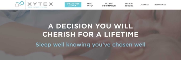
Xytex Biotech Website
More Xytex Website Screenshots
Weekly meetings with key client staff were a major factor in the smooth design and build of the website.
3 Media Web improved the design, technology, and usability of their rebranded website.
We worked with our client to create a new interface to their member and customer tools and dashboard, enabling users to register, search, and manage their relationship with Xytex.
The new website was built on top of WordPress to provide a robust CMS to administer their site.
We tightly integrated their API into the new website to create a seamless and cross-channel user experience across the website.
We met the Xytex deadline for completion, taking only six months to design, build, implement, QA, and execute a successful launch.
Why A Biotech Web Design Might Stall
Web design sometimes gets pushed aside at biotech startups because everyone is intently focused on getting the product to market.
While that makes sense, it can be hard for its biotech web design to catch up as the company grows.
Some of the challenges we deal with when it comes to redesigning biotech startup websites include:
Outdated Sites
Although this isn’t always the case, updating and improving an outdated website can be difficult and more time-consuming than starting from scratch.
You may try to take shortcuts and use functions already there or spend hours figuring out how to replace a graphic that no longer fits in the new design.
By the end, you may end up with a disjointed design that isn’t what you or the client pictured because you tried to fit a square peg into a circular slot.
You and the client need to decide whether the best route is to update or start from scratch.
Lack of Ownership
For your client’s or employer’s first entry into the world as a biotech company, they hired their local web designer or web manager to make them a website within their budget.
Maybe that website was good back when they were starting, but now they’ve grown, and their website and brand need to grow too.
That’s your job.
The problem? There could be a few.
Maybe as a result of their contract, the old web designer owns part of their website. Maybe the data and scripts aren’t accessible to them or you due to an unresponsive ex-web designer or outdated computer programs.
And maybe they lost their password, and that old web designer has run off to the middle of South America with Habitat for Humanity and has no cell service.
Unpredictable stuff happens.
It would help if you were prepared for it.
Lack of Web Expertise
Not all of us are web geniuses.
We like to think we are because we’ve been living in the internet age for what feels like forever, but we’re not.
With any luck, your client or boss will own it and admit their amateur status, but sometimes they may not…
Your client or boss may have once learned how to pick a lock on YouTube and now be convinced they can also unlock the intricacies of web design.
You need to be patient and take time to explain things to them in a way that comes across as informative, not patronizing.
Ineffective Internal Process
DIY websites don’t often come with detailed instruction manuals or guarantee self-explanatory controls.
Regardless of the website’s style, if you get a project and there are no controls or built-in processes to make it feasible for clients or your coworkers to manage the website, you have a problem.
It will be up to you to implement processes that make it easy for your clients to manage their websites without your help if need be.
3 Biotech Web Design Needs
In many ways, biotech startup websites are similar to other company sites.
They need a professional design that provides the information people are looking for with minimal clicks and drives growth.
Of course, to provide that, you need to be understanding when it comes to biotech companies’ unique needs and challenges.
When you can accommodate the following needs, you’ll be able to serve as a great partner in redesigning their website.
1. Regulatory Compliance
The world was built on rules.
Ask a physicist.
And as much as we may hate following them sometimes (ahem, jay-walking), if you’re working with or at a biotech company, it’s a necessity.
Because biotech companies are dealing with the U.S. Food and Drug Administration and aiming to offer stock to the public at some point, information and brand messaging need to be handled very carefully.
You need to figure out your client’s or company’s story and find a way to tell it to strangers, often while working with people who are new to marketing and focused on getting funding.
Work to generate a brand and marketing strategy that consumers can trust and rely on. Be familiar with the regulations and focus the website content on the company’s product can solve.
2. Flexibility
Startups are the epitome of change-rich environments.
They’re evolving on the fly, and they need to work with partners who are totally comfortable with that fluidity.
For instance, many startups might have difficulty deciding on one internal project manager to own the web design project.
Over the initial weeks of the website redesign, the proper people will get jostled into position in the organizational chart. Still, you can’t lose your grip on deadlines and objectives in the meantime.
You must lead the process and keep it moving.
3. Resilience
Startup CEOs are busy and may be absent even when they care deeply about its website design.
Your designs may go through junior employees who try to guess what the CEO likes.
It would be much easier and more efficient to deal with the final decision-maker directly, but that may not be realistic — and you have to roll with it. You’ll need to be resourceful and resilient.
Biotech Web Design First Steps
The innovation and dynamics at biotech firms make them challenging yet exciting companies with which to work.
If you keep in mind some of the challenges they may be facing, it will help the website design process go much more smoothly.
From regulatory compliance to courting investors to potentially changing the world, there’s a lot of complexity in a biotech startup.
Your job as a designer is not to allow that complexity to get in the way of creating a straightforward biotech web design with simple messaging that appeals to the right target audiences.

