in B2B web design poses specific design challenges.
Often, visitors come to a B2B website in search of information. They aren’t as interested in the glitz and glam of the website unlike when they visit other business websites.
But that doesn’t mean that your website has to be dull.
It’s just as important to provide them with the rich and engaging experience that a beautiful website entails.
Luckily, it’s not hard to balance a beautiful website with the information your B2B customers are looking for — you just have to know how to do it right.
The following elements will help you find that perfect combination.
Elevate Your B2B Website With Case Studies
Success.
That’s what everyone is interested in, whether it’s the company itself or its site’s visitors.
What better way to showcase your success than through case studies that can show your visitors just that?
The Brains
What’s great about case studies is that they balance creativity and factual analysis. Case studies are data-driven. They show you all the nitty-gritty work that went into creating that success.
The case study in itself highlights what you want your viewers to know. It will show how your business’ ingenuity benefitted other companies.
If they ran into any obstacles, it will show how you went about fixing them and reassure others that you are up to any kind of challenge thrown your way. Plus, a well-written case study will exemplify how your product is always getting better.
People want to know that you are responsive and attentive because it reassures them about the services you offer and lets them know that you’ll be there if they do have a problem.
The Beauty
You’re also telling a story. Case studies are a chance to flex your creative muscles and, rest assured, your visitors will thank you if you do!
No matter how poised and professional of a company you are, no one wants to read a 4,000-word case study full of jargon, facts, and statistics that reads like your refrigerator’s instruction manual.
No. One.
So get creative with it on your next b2b web design undertaking! The material you’re writing about will show your brains and ingenuity all on its own. The writing is your chance to get creative and draw viewers in.
Use humor and dialogue. Make jokes. Cheer yourselves on. Include quotes. Break your paragraphs up into one-liners that are easier to digest and then read through it yourself.
FURTHER READING: 5 Website Content Writing Tips
Of course, if you have a high tolerance for jargon-filled text, you may want to get a coworker’s opinion. But if you can read through the whole thing without getting bored and maybe even smiling a bit, then you’ve done your job and your viewers will appreciate it.
Find Out More
Interested in seeing a few examples or finding out more information on structuring your case study? Check out what we’ve listed below:
Bizible: 5 Examples of Exceptional B2B Case Studies
“Most B2B case studies follow this outline: Problem -> Action -> Result.
It’s a structure for the body of your case study that keeps it concise. Any reader will appreciate that.
“There other formats as well, including Q&A style. The strength of the Q&A style is that it tells a richer story from the perspective of the customer. If the customer uses common phrases and jargon related to their industry, it stands a higher chance of leaving a lasting impression with your prospects.
“It’s like going to a conference to hear your peers speak about a great solution they are using. You trust their judgment and the problem they solved is a problem you want to solve.”
CXL: How to Write Better B2B Case Studies: 2 Lessons from Psychology
“Many buyers rely on social proof. In fact, 94% of buyers go online to evaluate what their peers say about a product or service before deciding. So what’s going wrong?
“Having worked with dozens of B2B companies, I’ve seen way too many case studies consigned to the content graveyard before they’ve even drawn breath. Franken-jargon, weird acronyms, loopy narratives. It’s no wonder they get ignored.
“Two psychological concepts—cognitive fluency and narrative transportation—can turn yawnsome case studies into hard-working persuasion assets. Ignore either one, and your case studies are likely to fall flat.”
Right Source Marketing: 6 Examples of Innovative B2B Case Studies
“In a world where 91 percent of buyers prefer content that is more visual and interactive, it’s time for marketers to up their case study game. To give you a better idea of what’s possible and inspire you to find innovative ways to connect with your buyers, we collected a few examples that diverge from the case study norm…
“It’s no shock that SnapApp, an interactive content creation platform, decided to innovate with its case studies by — wait for it — making them interactive.
“Beyond making the case study interactive, SnapApp also includes questions that gauge buyer interest and offer the opportunity to qualify leads. The combination of an innovative format and thoughtfully positioned qualifying questions gives SnapApp the opportunity to drive a high volume of quality leads.”
Material Design Goes A Long Way In B2B Web Design
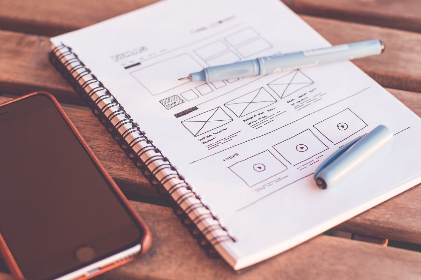
Material Design is a design system that helps you create a visually appealing and engaging website.
It helps you create an immersive experience for your viewer while blending design creativity with technological and scientific principles.
And, one of the best things about it is that it’s compatible with Android, iOS, Flutter, and the web!
The Brains
Of course, you always have your material and your product or service to show viewers your smarts, but Material Design helps you incorporate the theme you want as well as technological ideas.
You are guided by design methods that help you effectively use space and grids to organize your material, allowing you to create a hierarchy within your website that works for the viewer.
The setup of Material Design also makes it easy for you to implement any plugins that you want, as well as design elements that fit your brand and your vision for the website.
Plus, it includes an organized comprehensive guide to help you through the process.
FURTHER READING: Designing a Successful Education Website
The Beauty
Just about every aspect of Material Design helps your website turn into a beautiful and immersive experience for the viewer.
The themes and design elements capitalize on light, texture, and shadows while guiding you through methods of using color, imagery, and typography to help you create focus and meaning with your site.
It even incorporates motion! You can make objects appear on your screen or have your text slide in as you scroll. You could even have objects change and transform into something else or make parts of the screen reorganize.
Material Design was designed specifically to combine beauty and brains by helping you create a stunning setup for all of your brainy material.
Find Out More:
Although the Material Design website can give you just about all the information you could need about what it does, here are a couple of places to find some inspiration.
Mockplus: 12 Best Material Design Website Examples to Draw Inspirations
“As Matías Duarte, the vice president of Google explained:
“‘Unlike real paper, our digital material can expand and reform intelligently. Material has physical surfaces and edges. Seams and shadows provide meaning about what you can touch.’
“Basically, it’s a way to make design elements look like touchable, and the properties of Google itself are the best examples of material design. As of right now, a growing number of websites have been dedicated to this topic, and we’ve made a collection of the best Material Design website examples for you to get inspirations.”
WebFX: 11 Sites to Help You Find Material Design Inspiration
“Material design is a robust and flexible design system that you’ll enjoy using in your projects. Here’s a list of sites that will give you a near-endless supply of material design examples that you can draw inspiration from.”
Make Your B2B Web Design Pop With Cinemagraphs
Even if you don’t know what a cinemagraph is, you’ve probably seen one before.
Basically, they’re living photographs that loop infinitely without a clearly defined beginning or end. By general rule, they’re shorter than 8 seconds but the shorter the better so as not to slow downloading times.
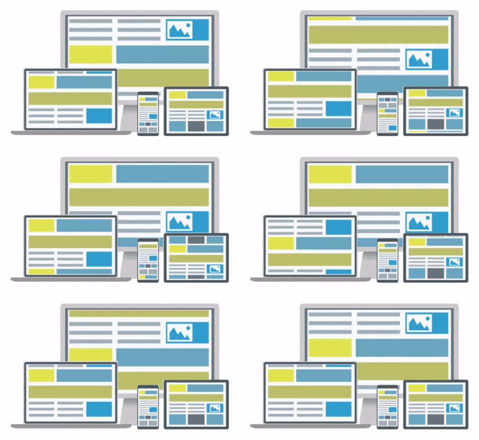
Still photos, as well as illustrations and graphics, can be cinemagraphs.
Luckily, because the technology behind the cinemagraph is always getting better, they are pretty easy to make yourself.
The Brains
Well, you can choose any image that you want. You could use a picture of a customer using your product, an employee working on it, or an image relating to the product or service itself.
With cinemagraphs, you take an image and choose what part of the image that you want to move in a continuous loop. So, you could even use them to show part of your product in action.
You can use these to draw attention to your material and keep people interested when they’re reading about what your business does.
The Beauty
These are an artistic feature that helps to spice up your web page.
While you can choose an image that shows the technological side of your business, you can also use them as decoration to help immerse the viewer and keep them on your page.
Emphasize specific details that stick out to you and use them to tell stories that engage the viewer.
If you’re trying to appeal to the more human or emotional side of viewers, the motion incorporated in cinemagraphs is a great way to do that because it is more than just an image.
Plus, there are still photography considerations. To create an effective cinemagraph you still have to use the artistic principles of photography to capture an eye-catching, high-quality photo that uses light and space to its advantage.

Traditionally, most of the image remains still with only one or two areas showing motion.
Find Out More:
What to see some cinemagraphs for yourself so you can apply them to your b2b web design project? Below we’ve listed some places you can find well-done cinemagraphs and more information on them.
awwwards: Cinemagraph Toast Crunch: Part of a Balanced Website
“The appeal of the technique lies in its alien nature. The human eye, above all else, is designed to detect movement. Staring at a photo, it’s obvious that you’re looking at a static moment in time…
“A cinemagraph contains an isolated area of an otherwise static background, which for some reason is dynamic. A space set aside to flap about without a care for the familiar continuity that the visual palette is accustomed to….
“In regards to web design, cinemagraphs can have a very diverse impact on user attention. They can be applied to draw interest, soothe tension, or even produce an emotive effect on the viewer.”
Medium: Why Should We Use Cinemagraphs for Digital Marketing?
From Medium:
“Cinemagraphs offer a more immersive experience for the user and therefore can be used as part of a digital toolkit for brands. Due to the introduction of movement, we can use cinemagraphs to tell stories and offer users a flavor of a brand’s artistic expression.
“From a business perspective, using cinemagraphs is a great way to let your clients know that you are a forward-thinking and contemporary company that is bang up to date with the latest digital marketing techniques. It is a way to stay ahead of the curve and get a competitive advantage over your business rivals.
“When used properly, a cinemagraph can be used to add elegance to your brand. A cinemagraph can gracefully capture a shine, glimmer or sparkle more effectively than a static image.”
HubSpot: How to Create a Cinemagraph in 7 Easy Steps
“As a marketer, you are probably already aware that images are important. They’re easier to digest than a bunch of words on a page and can help support your other content by telling a story in ways that words cannot. Whether in social media posts or in blog posts, images help your audience to better understand what you are talking about, plain and simple.
“Cinemagraphs can take things a step further.
“What Tools Do You Need?
“First, you are going to need to make sure you have what you need to create the cinemagraph:
- A way to record video (I used the camera on my iPhone 6)
- A tripod, or some other way to keep your camera stable and completely still
- Adobe Photoshop (I am currently using Adobe Photoshop CC 2014 on my iMac)”
Good Typography Is An Essential Part of B2B Web Design
Typography is a major consideration in the b2b web design process.
Images are great, but no website is going to get anywhere without text.
But you can’t just have any text scattered across your screen and expect people to pay attention to it.
This is where typography comes into play.
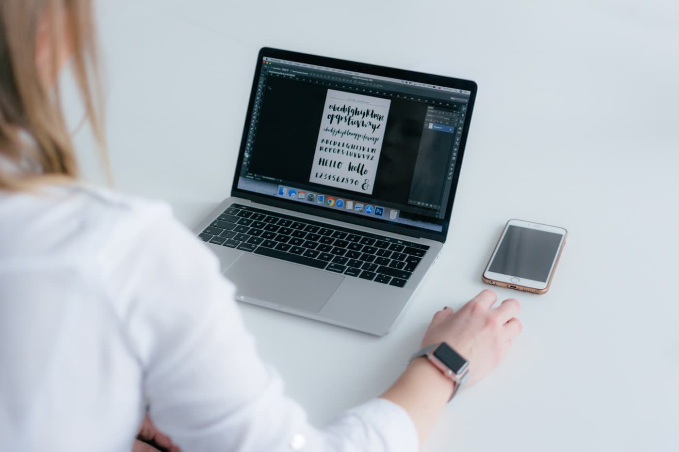
Typography is the style of the text you’re using. It includes everything from font to size to placement as well as the and arrangement of the text on a page.
While typography trends are always changing, it’s more important to find the typography that best suits your brand and what you’re trying to say.
The Brains
You can write whatever you want.
If you have a section of your website where you want to list the things you do but all of them are jargon-filled and chock-full of technical language, write it. If you use typography to your advantage and find the right font and boldness, people will be interested enough to click and find out more.
Just make sure you explain it all thoroughly.
There are dozens of fonts out there and dozens of analyses on different types of fonts and what famous companies they have been used for. You can find out what fonts are associated with what and do your research on what colors appeal to who.
Do an analysis based on your targeted viewers and use the flowcharts that are all over the internet to direct you to a font that is perfect for your text.
The Beauty
Words can be pretty too.
If you ever have done a project and spent half an hour scrolling through fonts to find the perfect one for your title, you know this.
Finding a font and color that matches your brand is important, but that doesn’t mean that you can’t and shouldn’t tap into your artistic side. Find a variety of fonts that could work for you and a range of colors, and then choose the ones that you think look best together and are the most eye-catching.
If you’re trying to decide how big to make the font or where to put it on the screen, play around with it.
Weigh how important that information is compared to other information you’re planning to display and then try some things out. Change the size and placement and pick the spot that is visible but also interesting.
Typography is an excellent place to use your artistic side. Because there are so many options, it’s easy to balance the research and analytics with what looks good to you.
Find Out More:
Below you can find excerpts and links to sites that will give you some of the research and advice you’re looking for when managing your typography.
CXL: The Effect of Typography on User Experience & Conversions
“More font choices mean more personality, expressiveness & creativity, which brings me back to the original point of the article, your typeface is the body language. It’s what helps create that emotional connection which can be so critical to the sales process…
“In a study on The New York Times website, titled “Are you an optimist or a pessimist?” Errol Morris wanted to see how people would respond when asked about their feelings of security in a catastrophic event – over 45,000 participants responded.
“Readers were asked if they agreed with the statement and to what degree.
“The real agenda behind the quiz was to determine if test subjects would find the statement more believable depending on the choice of typeface.”
WebFX: 10 Infographics That Will Teach You About Typography
“This is really a flowchart and cheatsheet with graphic designer Julian Hansen’s suggestions on how to pick a font for a design project, but it does embody the essence of what an infographic is: to present useful information in a visual way.”
Neil Patel: How Typography Affects Conversions
“A study conducted by Dr. Kevin Larson of Microsoft and Dr. Rosalind Picard of MIT looked at whether typography can affect mood and cognitive performance. The study was divided into two parts, and three different measurements were taken: relative subject duration, Likert scale, and a cognitive task.
“There were 20 participants in this study, out of which half got text with good typography and half got text with poor typography. In the first part of the study, for the relative subject duration, it was found that participants who got text with good typography underestimated the time they spent reading it by 3 minutes. In the second part of the study, when participants were interrupted 17 minutes into their reading session, they underestimated their time by 5 minutes and 21 seconds.
“This showed that when the passage was typographically well-formatted, people were so engrossed in the subject, that they underestimated the time they spent reading it.”
FURTHER READING: 3 Media Web Named to Top 10 by Boston Business Journal
The Real Secret To The Best B2B Web Design Projects

3 Media Web knows b2b web design is a collaborative effort.
Partner with an established web design agency that has demonstrated experience building websites similar to the style you are after. A dedicated B2B web design agency or developer will know exactly how to create a website that wows your customers and drives sales.
They will work closely with you to ensure they understand exactly what your B2B wants and needs in a website. If you’d like to chat with a 3 Media Web partner about your b2b web design project and see how we can help, contact us today!

