As a credit union, Millbury Credit Union is owned by its members. Their six locations serve more than 28,000 members in Worcester, MA and surrounding areas with the products and services expected of a financial institution. They needed an accessible website designed for all of their clients.
They feature low fees, good rates, excellent service, and the insurance protection of the National Credit Union Administration
A Contemporary Accessible Website Design
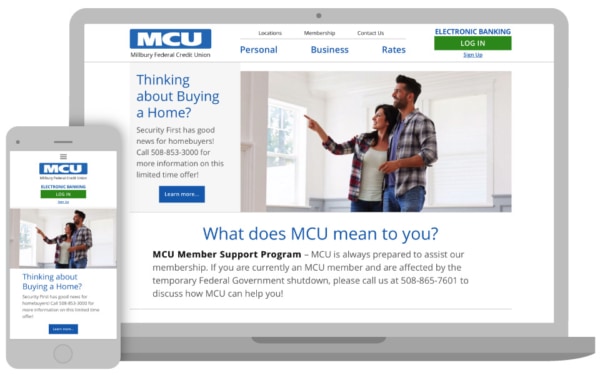
MCU’s key goal was to create a new website with an updated design and navigational flow to better reflect their current status as a growing and forward-thinking institution.
3 Media Web worked with the MCU designer to create a clean and contemporary design that is uncluttered and inviting. Gone are the advertisements and sidebar links that were distracting readers from the main MCU message.
Easy to Update CRM
3 Media Web built the MCU website using WordPress as the Content Management system, making it easy for internal stakeholders to manage the content on the site.
This includes deposit and mortgage rates, interest rates, and home equity loan rates, which are updated on a daily basis.
Accessibility Important to MCU
MCU selected 3 Media Web because of its expertise in creating a website using best practices for accessibility, integrating features to aid those with physical limitations to be able to use the website and online banking successfully.
Every interaction on the website can be completed with just the use of a keyboard. No mouse is needed for those with vision and motor skill disabilities.
The text on the pages of the new MCU website is large, and the page uses colors that provide the contrast needed for ease in readability. Scrolling vertically, the readers encounter dynamic and engaging images with minimal text to guide them to appropriate areas of interest.
Each of the service areas has links embedded in the images and captions, as well as a button link that clicks through to detailed information.
The interior pages for personal and business banking include large images with a side menu for each of the sub-areas listed in the drop-down menu. This allows the web visitor to click through to any of these areas without having to return to the Home page.
The details of each type of banking service are presented with bulleted text for clarity in an accordion format that opens and closes with a simple click on the + or – sign.
(Sound interesting? if you’re looking for help with accessible web design or ADA-standard web development, we can help.)
Simplified Accessible Website Navigation
The main navigation bar contains three key topics with drop-down menus that click through to interior pages. The sub-navigation bar completes the menu with Locations, Membership, and Contact Us links. A large Electronic Banking Log-In or Sign Up button at the top right is obvious and welcoming.
Three boxes on the Home page (and repeated on each of the interior pages) link to significant areas of interest for web visitors: Anytime. Anywhere. Checking; Loan Programs; and Mass Save HEAT Loan Program.
Two of the three link to outside websites, so they are introduced via an ATTENTION message that advises that the reader will leave MCU’s website and enter a website hosted by another party. A button gives the reader a choice to continue or to cancel the link.
Online Banking
The electronic banking link in the upper right corner uses a simple log-in with only username and password required. The Sign-Up link takes the reader to an information page with bulleted text and a button to access an application form.
Client Goals Achieved
Millbury Credit Union was working with an outside web designer when they called upon 3 Media Web for development and project management of their new website. While it was atypical for 3 Media Web to not include design and web support/hosting in their service contract, the collaboration was smooth and allowed MCU to retain the relationship they had with their graphic designer and IT support company.
The client’s goals for a new website that expresses their growth and success was achieved with an updated design and improved presentation of content.
Financial institutions have a wealth of information to share with their members, customers, and prospects. 3 Media Web created a website for Millbury Credit Union that provides this data in a way that elicits interest and offers a guided flow that is accessible and user-friendly.


