Website design or digital marketing trends posts come out every year, but often, the trends predicted are already passing out of favor. What are the trends that are so red-hot that they’ll never fade?
Well, we asked experts from across 3 Media Web’s award-winning teams in web design, website development, digital marketing, and more for the trends that they see emerging and sticking around for the long haul.
Let’s see their favorite trends––the ones they can’t get enough of, the website features or design styles that make them giggle with joy.
The Hottest Website Design Trends Tickling Our Fancies in 2024
Here are some of the most exciting trends in web design, digital marketing, and more from across our team of website strategy experts.
Make Site Visitors Think You’re Hiding In Their Bushes
“It’s impossible to take website personalization too far––the more specific, the better. I’ve had a couple of experiences where the website knew a little too much about me––and I loved it. It went from ‘Hey, these people know what I’m looking for’ to “Are these people hiding in my bushes?’
If I’m going to work with a business, I want them to feel like a close neighbor.”
–– Tom Broadwater, Sr. Digital Strategist
I Got a Fever…and the Only Prescription is More Carousels!
“Text-only carousels, like client testimonials with large text boxes and no images––that rotate quicker than I can read all the text––, I’m a huge fan of those. It keeps me reading it through two, three, maybe four times.
Especially carousels that auto play, those are the best.
We need to see more of those.” –– Jenny Mills, Account Manager
Speaking of Autoplay––Yes.
“Speaking of autoplay. I LOVE it when sites have a video that autoplays. I always leave my sound on at full volume because I have a young baby. When she’s napping in my office, I need to know when someone is trying to reach me, so my notifications are set to full blast volume. So autoplay videos on a website, with full volume, really grab my attention.
“Also popups. When you go to a site to browse, you have to close out several pop-ups offering discounts and whatnot, the really aggressive kind that’s just engaging and must deliver a lot of revenue.
“I never want to leave those sites.”
–– Brittany Meyers, Jr. Account Manager
Shhh… No one can tell an image is AI!
“I’ve seen a lot of AI-generated images in blog posts lately––and I can’t get enough. They all have the same glowing, cartoonish aesthetic with the occasional extra arm or misplaced nose, and I’m just a really big fan. I never thought I could leave my love of stock photography behind but with the growing trend of using A.I. for basically everything a human does, I believe we are in good hands.
Bring on Skynet.
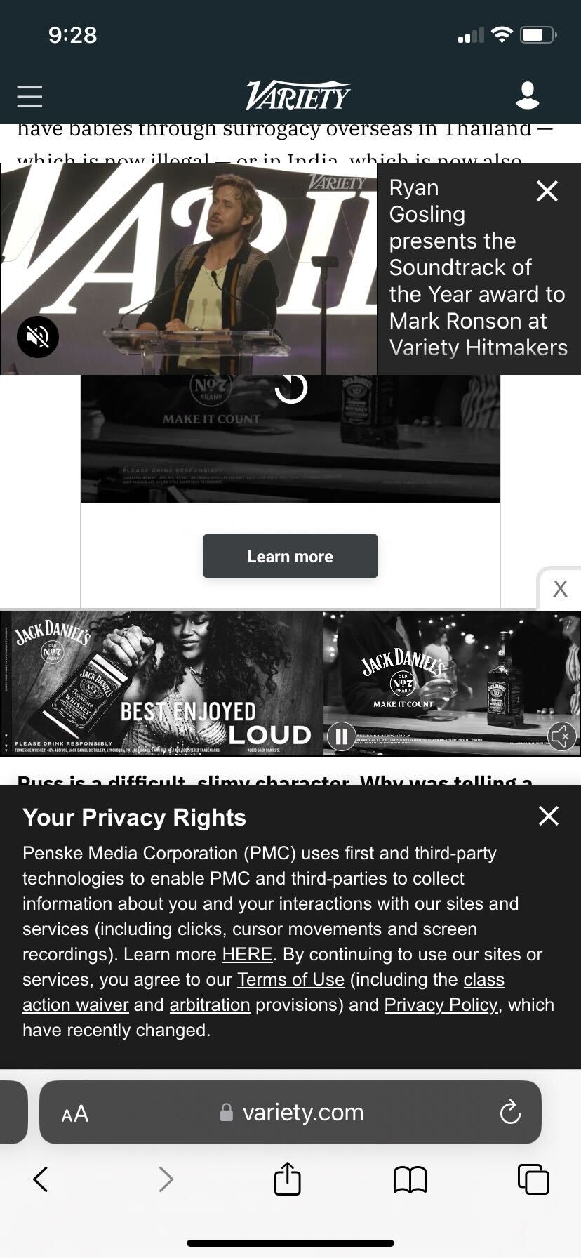
“I also love pop-ups and overlays on mobile. Who says that just because I’m on my phone, I should miss out on all that super important information, like signing up for a newsletter? I need to know about that! Here’s a screenshot I took the other day trying to look at an article on Variety––I just loved it so much I had to save it. You can literally only see one line of text, and that’s all you need because those popups must be really important.” –– Step Schwarz, Director of Technology

If Colors Burn Your Eyes, That Means They’re Working
“I love neon colors in marketing materials. LOVE THEM.
They really grab my attention and make me fall in love with a website.” –– Sarah Surprenant, Project Manager
Hooray for April 1st! We asked the 3 Media Web team for website features or current website trends that make their skin crawl––and then we created this blog post with them sharing their love for those same trends. Make sure to call them on our LinkedIn or Facebook page and tell them that you love those trends too. Happy April Fool’s Day!
