The Client: Law Offices of Daniel A. Hunt
Our client, the Law Offices of Daniel A. Hunt, are California-based attorneys with 11 offices across the state. The Law Offices of Daniel A. Hunt focuses on estate plan creation, administration, and litigation, in addition to probate and conservatorship.
The Challenge
Our client’s previous website was outdated and offered a substandard customer experience due to its unorganized content structure.
In addition to having too many pages on the site, the pages had too much text, broken videos, and other similar challenges we often see when helping clients refresh their websites.
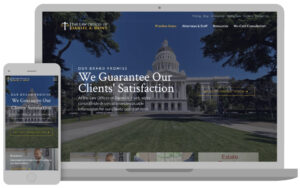
Ultimately, the main pain point we needed to address was to create a fresh, modern website with more organized content to showcase their areas of practice and offer their clients an easy-to-navigate website full of helpful resources.
The Solution
With all of our clients, the discovery process is a collaboration between our clients and us. The project we completed for the Law Offices of Daniel A. Hunt was no different.
We discussed the design process and the content restructuring decisions with a large team of advisors working on behalf of our client during our meetings. Due to COVID, however, we eventually began working directly with Stacy Grow (Director Of Marketing & Client Experience) and Daniel Hunt (Owner / Director Of Litigation).
Refreshing Outdated Content & Building a More Resourceful Website
Building off our conversations during the discovery phase and beyond, our team created a brand new website for our client.

On the newly refreshed website, all of the pages were re-written by the client and provided to us to incorporate into the design. We also imported all of their existing blog posts and updated them to match the new styling.
A robust resource area was added to the site, providing a multitude of useful assets for our client’s customers, including a library of educational videos as well as a FAQ section.
Importantly, we provided digital experience optimization, restructuring the site’s content and providing a more organized look and feel. This not only added to the aesthetics of the site but was also essential to help users navigate the site and find what they were looking for quickly and easily.
The Results
First and foremost, our clients immediately realized the benefits of having a more organized website that delivers enhanced customer experience and makes it easier to provide their clients with information.
Although the site was just launched, it is entirely expected for our client to also see an influx in leads thanks in part to the site’s improved SEO performance. We will continue to monitor our clients’ performance and provide them with relevant updates and additional maintenance as time passes.
Download the case study below!

