Founded in 1984, CORD (Cape Organization for Rights of the Disabled) is the only independent living center in the region that provides services and advocacy to enable choice, dignity, full access to the community and control of life for those living with disabilities.

CORD is a non-profit organization whose service area focuses on Cape Cod and Nantucket, Martha’s Vineyard, and the Elizabeth Islands in Massachusetts. Cape Organization for Rights of the Disabled advocates for the rights of individuals with disabilities to promote a barrier-free environment for all.
They provide a range of services to help individuals obtain the benefits and services they need to achieve their goals for independent living. CORD offers support and advisory services, including peer counseling, skills training, advocacy, and transition services.
(Before we start: if you’re looking for help with accessible web design or ADA-standard web development, we can help.)
Combining Two into One
The client required new branding and a completely new website that combined the content from two concurrent websites. However, the messaging needed to be written from CORD’s prospective clients perspective to address the problems they face daily.
The CORD websites were dated and text heavy. They failed to engage visitors; instead, they sent visitors to other websites with external links. The new CORD website needed to resonate with a variety of website visitors: prospective clients, donors, volunteers, and those in a position to refer prospective clients to CORD.
The content, that was a collaboration between CORD staff and Red Javelin Communications, successfully engages website visitors and is written from the viewpoint of individuals with disabilities.
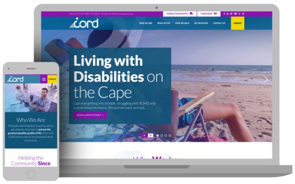
The use of a beach scene for the Home page hero image ties visually with the organization’s service area. The tagline: Living with Disabilities on the Cape supports the client’s goal for branding.
This tagline draws the reader into a personal account of one of CORD’s clients with an engaging headline and invitation to read one of the Home page gallery’s changing photo images, each with another client story.
Web Accessibility a Key Goal
Because CORD is operated mainly by those with disabilities for people with disabilities, a key requirement for the accessible website redesign was that the site be compliant with WCAG (Website Content Accessibility Guidelines).
3 Media Web’s digital accessibility experts ensured that the Cape Organization for Rights of the Disabled website complies with Web Content Accessibility Guidelines.
Not only with regard to text size, site colors, alt descriptions for images, and text narratives for audio, but with other technical features, such as pause buttons within the image gallery, audio, and video, which give the user control to manage the advance manually.
Another feature that aids disabled individuals is on forms, such as Contact Us, where the captions for fill-in boxes move out of the way when that box is clicked. This enables the screenreader to know which form field the user is on.
3 Media Web created the new website using energetic colors, while keeping with the WCAG for high color contrast. The result is a vibrant look using purple and white, maintaining full accessibility.
Direct and to the Point
The client stressed that the new website minimize text and that the content stress the user’s viewpoint rather than focus on programs. 3 Media Web designed a banner beneath the hero image gallery on the Home page that explains the mission of CORD in a single sentence.
The text is superimposed over a background illustration of a wave, offering a subtle, but effective branding design element which appears throughout the site.

Three questions in separate boxes below with links to learn more stress Cape Organization for Rights of the Disabled’s main assistance areas: Mobile Food Pantry, CORD Services, Youth Services.
Simple Navigation/Comprehensive Message
The main navigation tabs are straightforward: Who We Are, What We Do, How We Help, and Get Involved.
Each link to interior pages that explain the various facets of CORD, without overwhelming the reader. Contact Us and Donate buttons round out the navigation bar along with shortcut links to the Mobile Food Pantry and Cape Organization for Rights of the Disabled News.
The Who We Are section supports the branding message with the organization’s history since 1984.
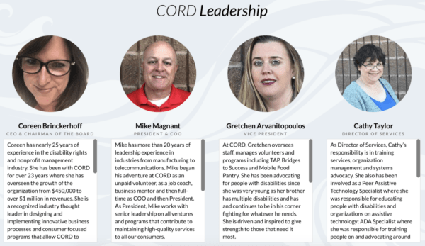
The page includes headshots and biographies of their leadership, a mission statement, and a narrative of how CORD defines a disability.
Included is a collapsible accordion FAQ section, and a thank you to their corporate sponsors (with company logos).

A link to the Membership sign-up page achieves the client’s goal of creating a grass-roots donation campaign, building support for the organization from individuals who support their mission.
How CORD Stands Out in the Community
In the What We Do section under Community Services, 3 Media Web paired brief narrative descriptions of what Cape Organization for Rights of the Disabled is doing in its communities with images that support their mission. Topics such as Community Workshops and Training, Disability Laws and Regulations, Employer Awareness Workshops, and Unintentional Discrimination are included.
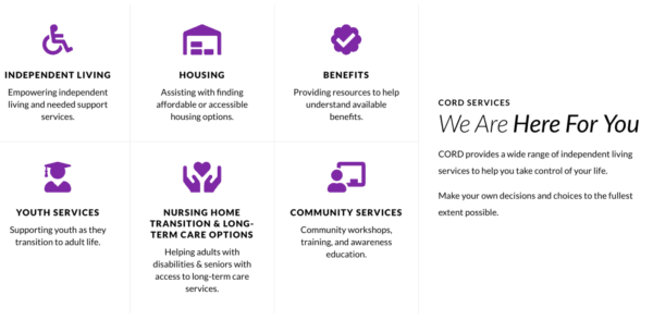
The What We Do Section has icons with links to full descriptions of programming on housing, benefits resources, transitioning youth to adult life, nursing home and long-term care options, and awareness education which provide detailed information for those who seek it.

3 Media Web achieved an important CORD goal for the new website to provide prospective clients an efficient and informative first visit and to deliver a peer-supportive, five-star consumer experience.
Multiple Spheres of Influence
In addition to their main demographic of disabled individuals, CORD’s targeted marketplaces include family members, the medical community, volunteers, and prospective donors.
3 Media Web addressed the need to speak to each group by creating a Get Involved link with content that resonates with them and builds their base of volunteers, employees, and donors.
The new CORD website is a complete integration of content and accessible digital marketing.
This comprehensive project included a team from all areas of marketing, working together from concept to launch and beyond with follow-on digital marketing post-launch.
The new CORD website successfully addresses its various constituencies and supports its mission as a primary resource for individuals with disabilities.
With its improved visuals, the site drew universal applause from end users. 3 Media Web led a well-organized process. They provided a roadmap to the project, ensured that all parties kept to schedule, and offered guidance on best technical practices. Currently, they’re helping with a PR initiative.
Mike Magnant, President, Cape Organization for Rights of the Disabled
